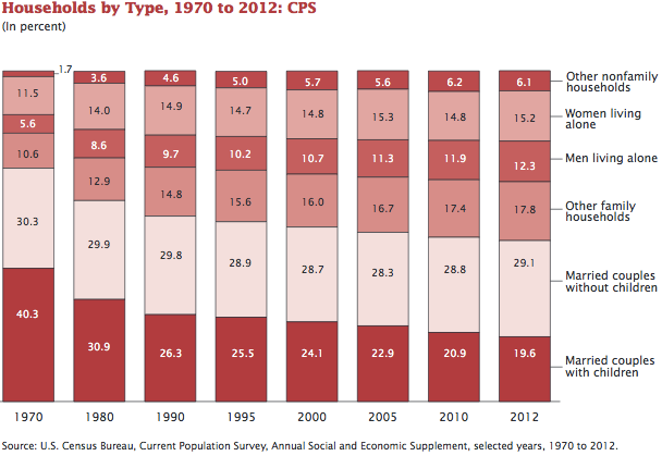
Bar chart The inutility of stacking columns When I see a stacked column chart like this: (via Andrew Sullivan)
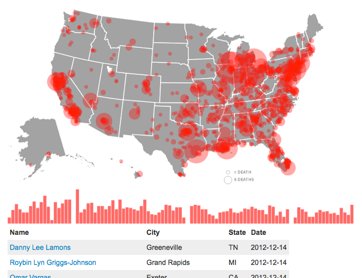
Aggregation Two unhealthy submissions from readers Josh hated this "dataless visualization" from ABC. (link; warning: ads)