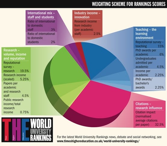
Bar chart Failed university education The Times Higher Education magazine fancied itself an arbiter of good universities
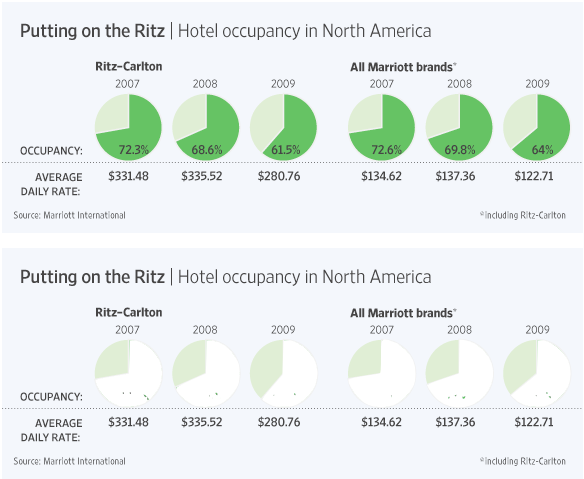
Business Pies fail to deliver The Wall Street Journal reported that the Ritz-Carlton brand of hotels has
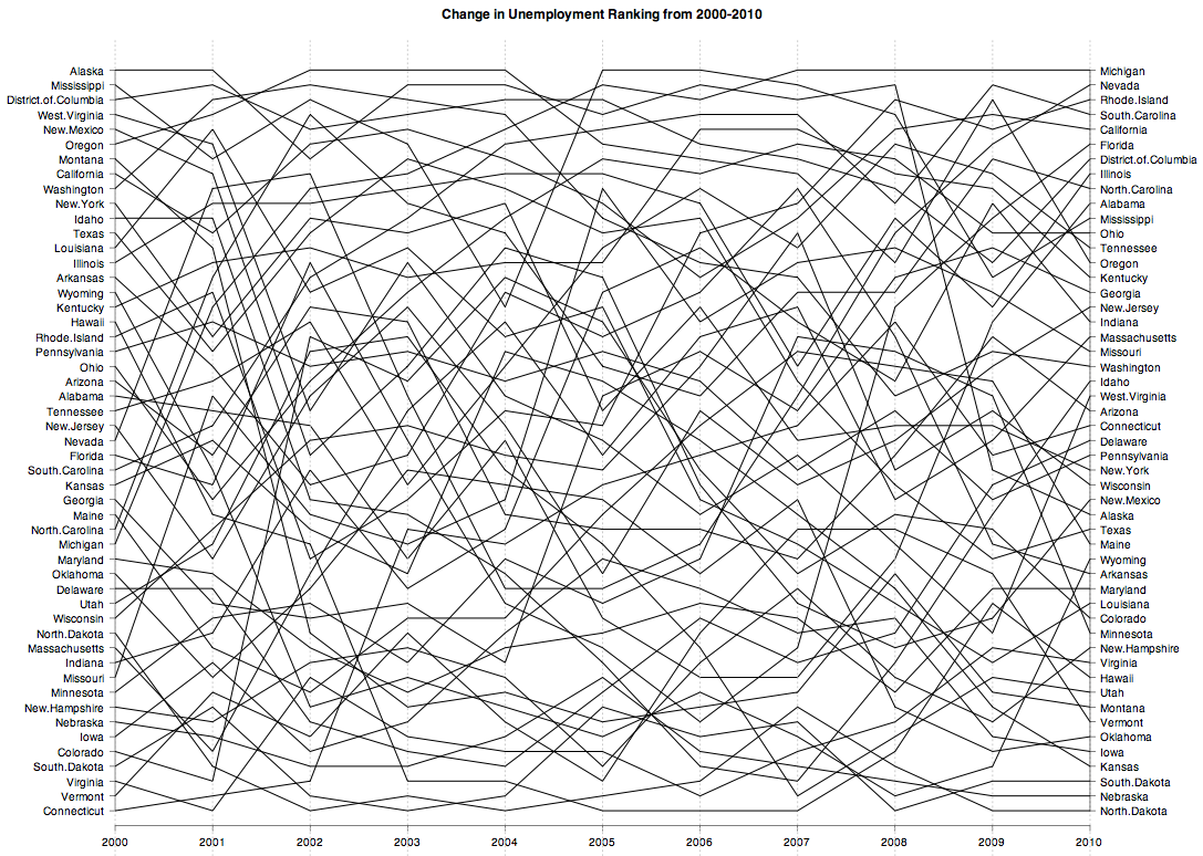
Aggregation Further views of unemployment Instead of looking at unemployment rates across the 50 states plus D.
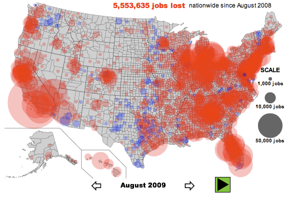
Aggregation Different pictures of unemployment Unemployment and job losses being such a worrying social problem in the