Junk Charts
  • About
  • RSS
  • Posts by Year
  • Posts by Keywords
Sign in Subscribe

junkcharts

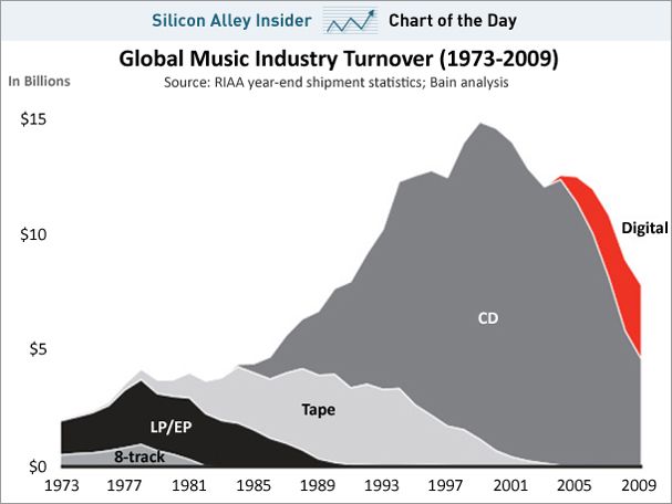
The chart that reveals a mysterious death
Area chart

The chart that reveals a mysterious death

I agree with Business Insider that the following chart is attractively drawn.
Read More
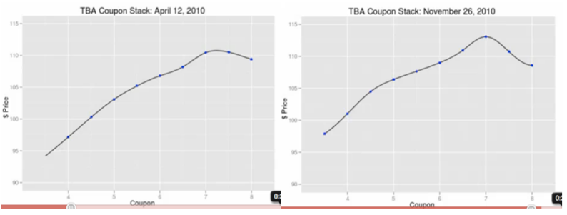
A graphlick showing mortgage prices
Business

A graphlick showing mortgage prices

The work of Hans Rosling and Gapminder (now part of Google) highlighted
Read More
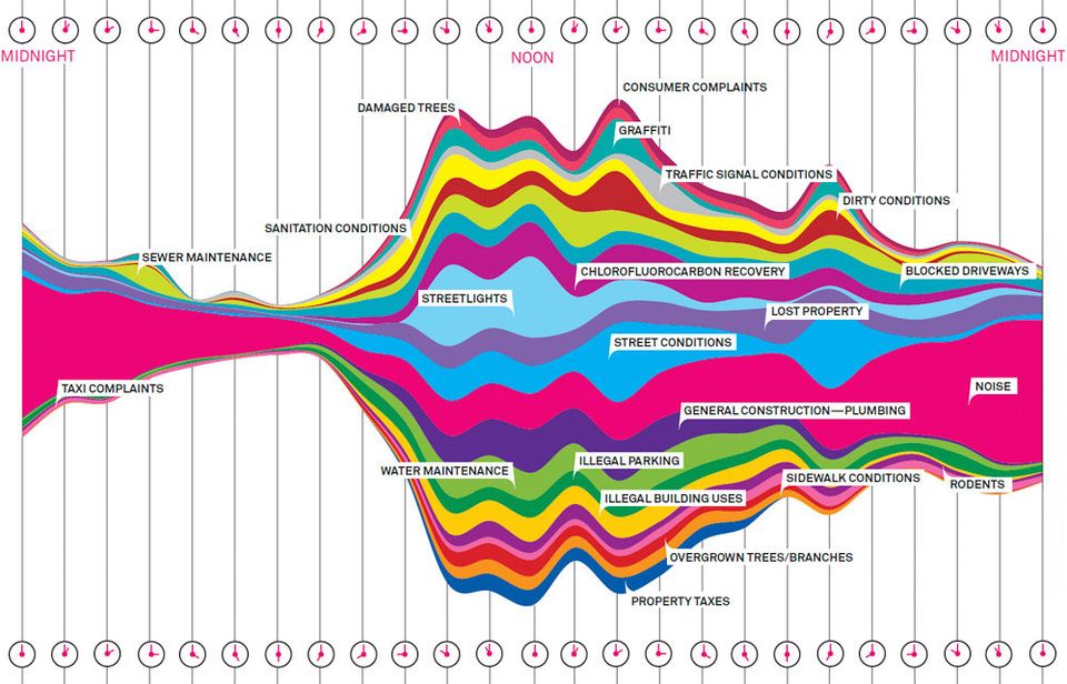
Making charts beautiful without adding unneeded bits
streamgraph

Making charts beautiful without adding unneeded bits

What is the message?
Read More
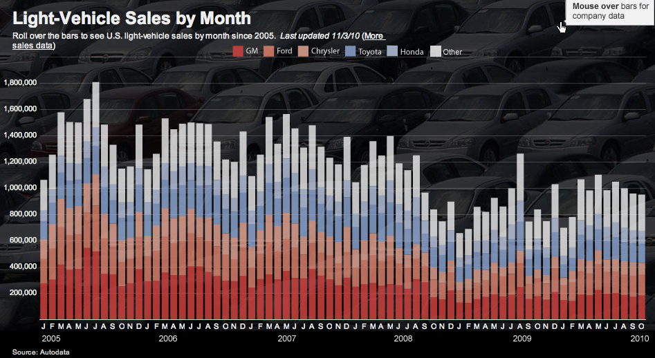
What is seasonal adjustment and why is it used?
Aggregation

What is seasonal adjustment and why is it used?

Quick guide to seasonal adjustments
Read More
Blogs

Two RSS feeds

I learnt at the JMP Conference that many of you who are
Read More
Failed university education
Bar chart

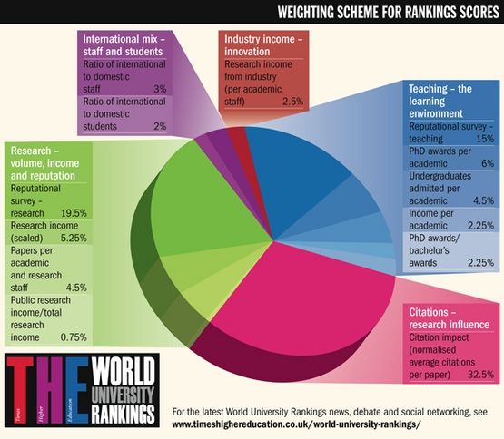
Failed university education

The Times Higher Education magazine fancied itself an arbiter of good universities
Read More
← Newer Posts Page 38 of 64 Older Posts →
Junk Charts © 2026
  • BOOKS
  • COURSES
  • PRESS
  • CONSULTING
  • COACHING
  • CONTACT
Powered by Ghost