Junk Charts
About
RSS
Posts by Year
Posts by Keywords
Sign in
Subscribe
Legend
Background
From bad to worse
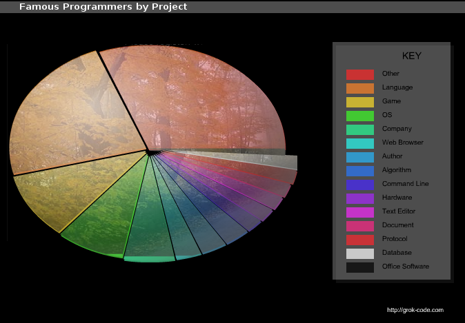
Pie charts can range from bad to worse. Brent L. pointed us
Background
Political theater
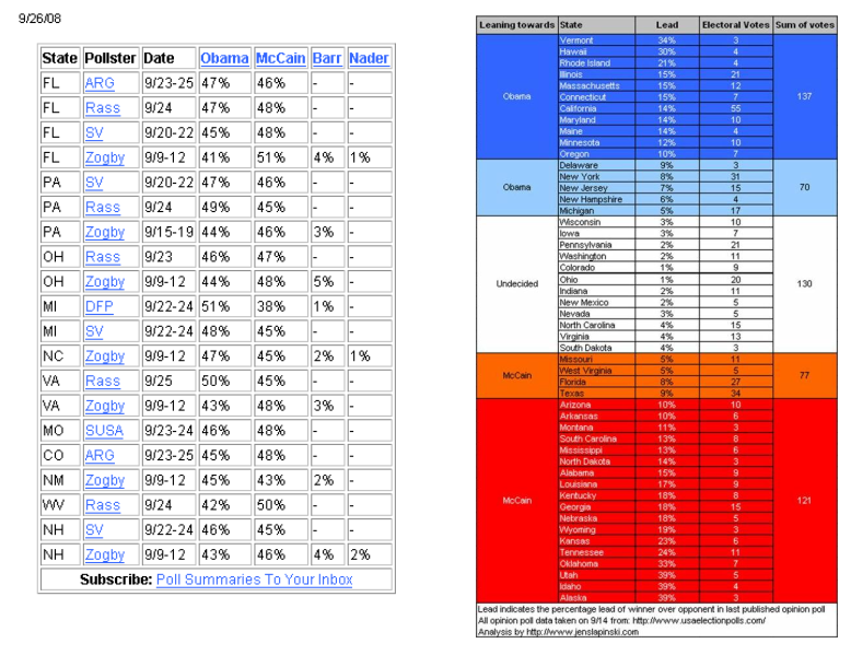
Jens, a long-time reader, tried to re-make the boring data
Color
Cram it like Koby
You have to gradually build up your gut by eating larger and
Data labels
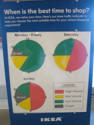
Clocks and pies
Keith A submitted this graphical idea from the folks at Ikea (via
←
Newer Posts
Page 7 of 7