Axis Small tweaks that make big differences Some small tweaks to data graphics make a huge difference
Aggregation Using disaggregation in dataviz Disaggregating data can be very useful when making charts
density A nice plot of densities, but what's behind the colors? Kaiser is intrigued by a plot of densities.
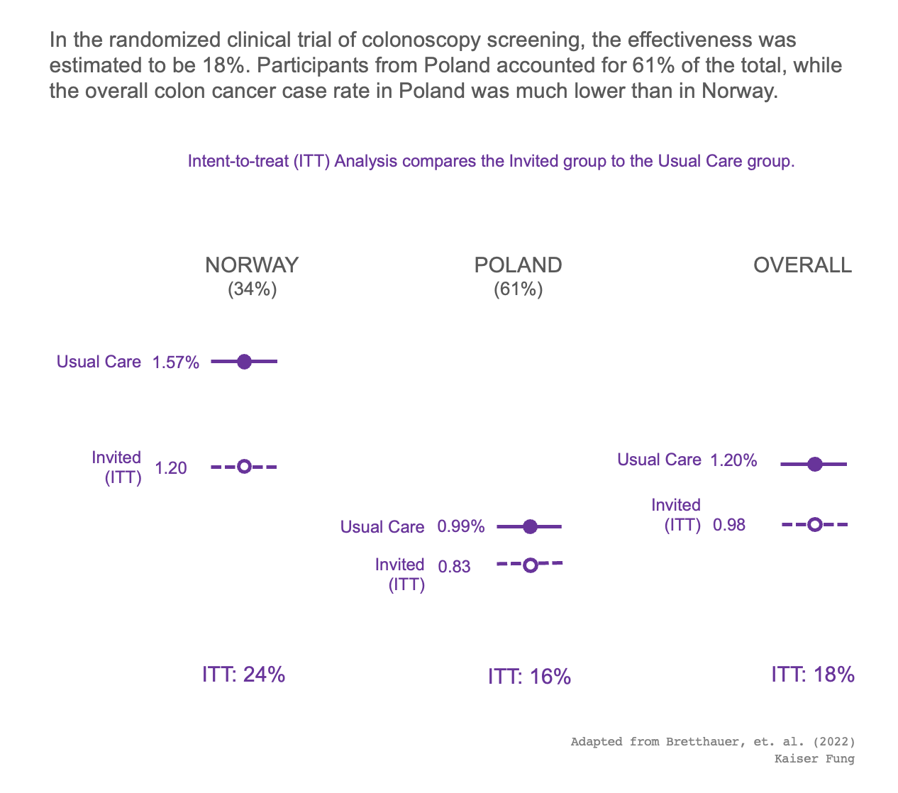
Cause-effect Other numbers from the colonoscopy trial Kaiser highlights some other metrics from the colonoscopy study
observational data With adjustments comes responsibility Kaiser explains how adjusted per-protocol analysis leads to different conclusions in the colonoscopy trial.