Junk Charts
About
RSS
Posts by Year
Posts by Keywords
Sign in
Subscribe
NYT
Table
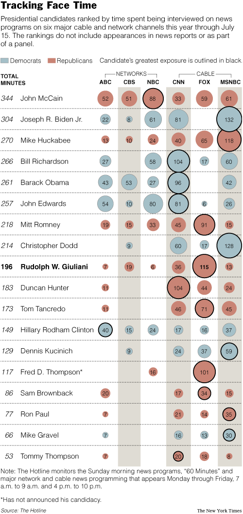
On the bubble
A couple of you noticed this table of bubbles in the Times,
NYT
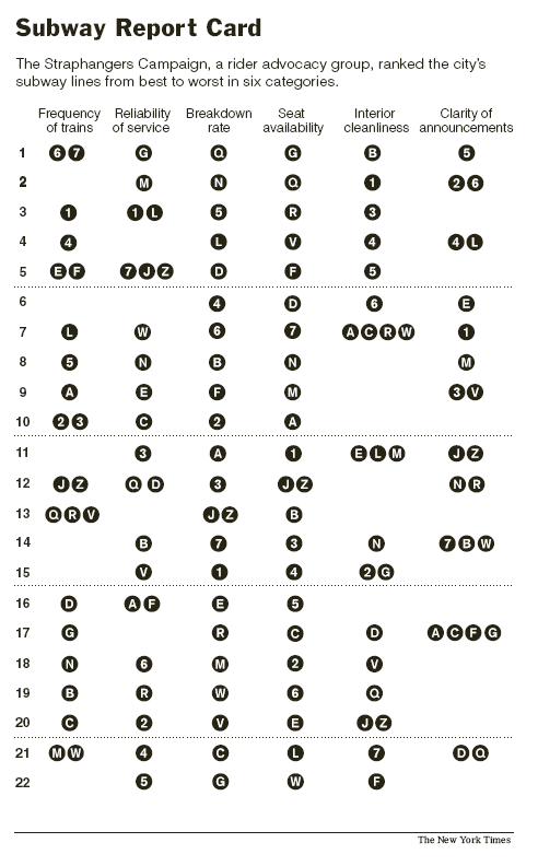
Noisy subways
This NYC subway report is impossible to read. However, it is very
Aggregation
Shower of bullets
Here's one of those infographics that makes the reader work
Dot plot
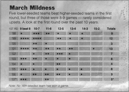
March mildness
The Times published this great graphic to show 2007 was an upset-
Science
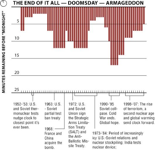
Losing count of Doomsday
The Doomsday Clock is making the news today: because of the growing
Color
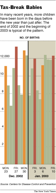
End of year effect?
I agree with JF who suggested that this chart was mind-boggling.
←
Newer Posts
Page 9 of 11
Older Posts
→