Junk Charts
About
RSS
Posts by Year
Posts by Keywords
Sign in
Subscribe
Outlier
Aggregation
Dealing with skew
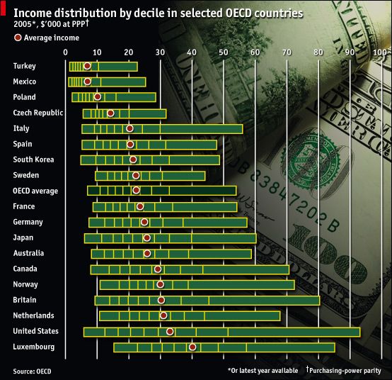
Bernard L pointed us to this income distribution chart printed in the
Blogs
How to read a graph
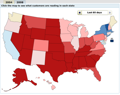
Via Gelman, here is a nifty book-buying map from Amazon, displaying
Axis
Bound to extremes
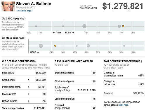
The New York Times continued to push the envelope by printing super-
←
Newer Posts
Page 2 of 2