Animation Light entertainment: Spinning wheel at the fun fair @TheChadd submitted the following chart via Twitter. I don't know
Bar chart The meaning of most Megan McArdle started the war on infographics (link). And reader Danielle A.
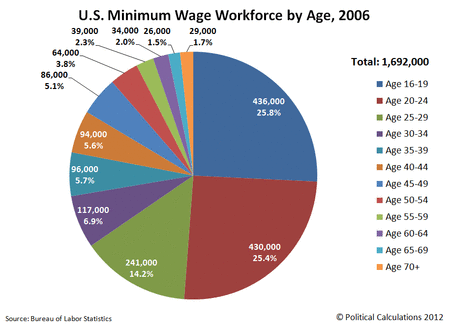
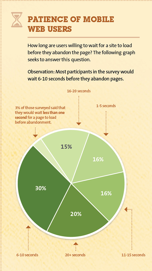
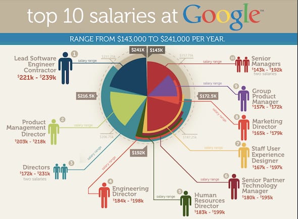
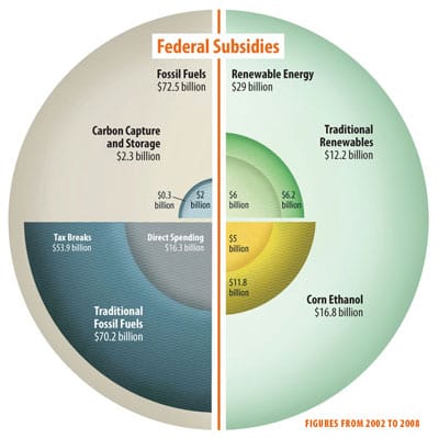
Bar chart The massive burden of pie charts The world would be a better place if pie charts were banned.
Current affairs Return this plate, I want my pie chart Reader Brad E. reminds me about the USDA's attempt to
Aggregation Worst statistical graphic nominated Phil, over at the Gelman blog, nominates this jaw-dropping graphic as the
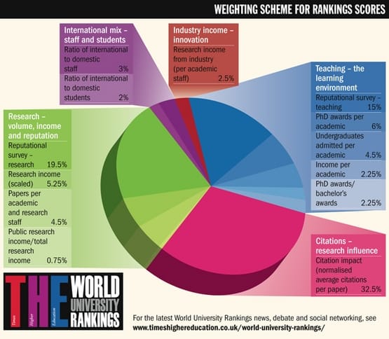
Bar chart Failed university education The Times Higher Education magazine fancied itself an arbiter of good universities