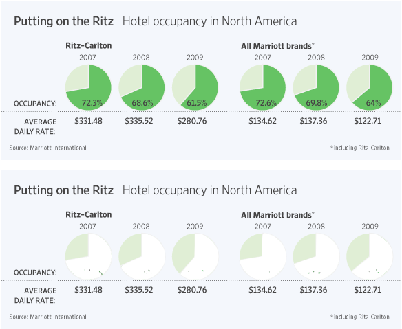
Junk Charts
  • About
  • RSS
  • Posts by Year
  • Posts by Keywords
Sign in Subscribe

Pie chart

Spinning the climate
Bar chart

Spinning the climate

Mike L. pointed us to this pair of "climate change model
Read More
Spinning multi-color
Aggregation

Spinning multi-color

New York Times has a great pointer to the Global Warming Art
Read More
From bad to worse
Background

From bad to worse

Pie charts can range from bad to worse.  Brent L. pointed us
Read More
Sloppy statistics
Aggregation

Sloppy statistics

As hinted in the previous post, there are rare situations in which
Read More
Seth on bar charts
Bar chart

Seth on bar charts

Seth followed up his post about graphics with a specific post about
Read More
Close races
Bar chart

Close races

Perhaps harkening to the close race between Obama and Clinton, the designer
Read More
← Newer Posts Page 5 of 7 Older Posts →
Junk Charts © 2025
  • BOOKS
  • COURSES
  • PRESS
  • CONSULTING
  • COACHING
  • CONTACT
Powered by Ghost