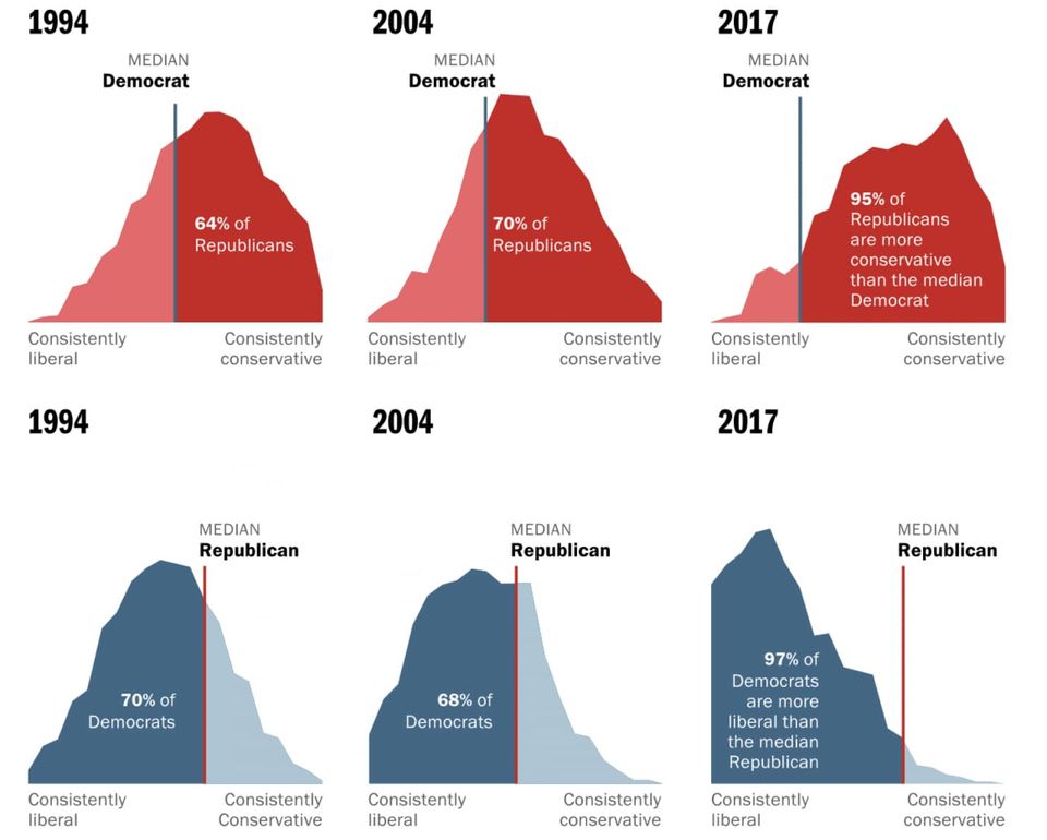
Area chart Let's not mix these polarized voters as the medians run away from one another In-depth look at Washington Post's fantastic feature on median U.S. voters
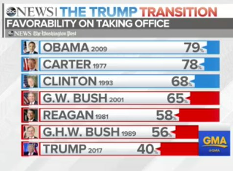
Bar chart Butcher: which part of the leg do you want? Me: All of it, in five pieces please This ABC News chart seemed to have taken over the top of
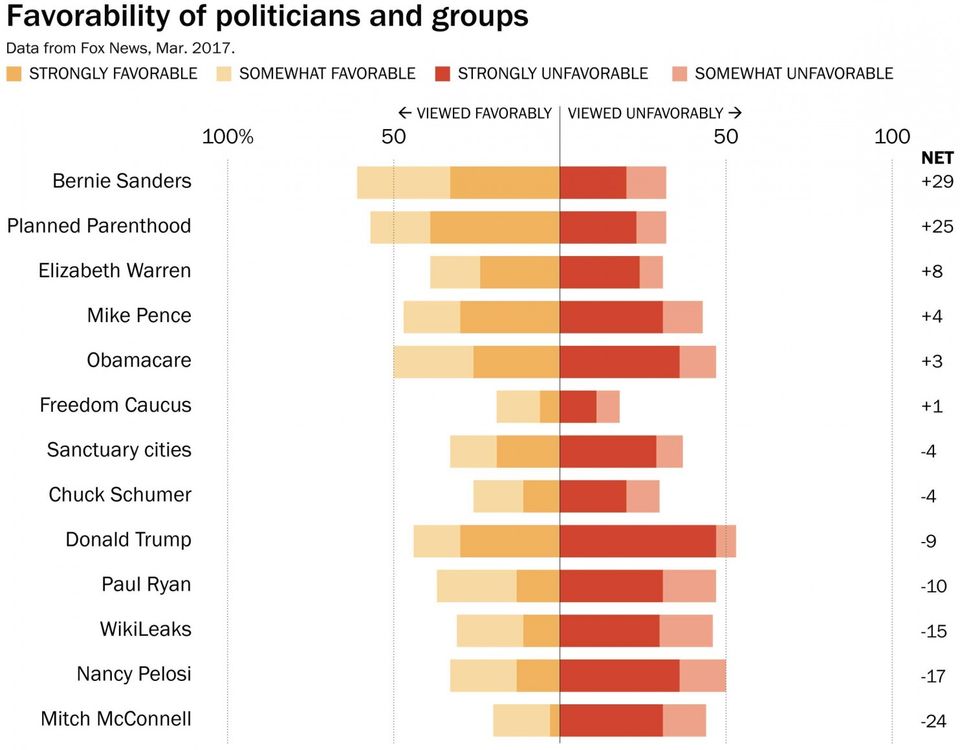
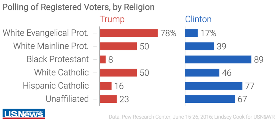
Bar chart Dot plots are under-valued, that's all Bar charts are over-used and over-rated. Just casually, I found
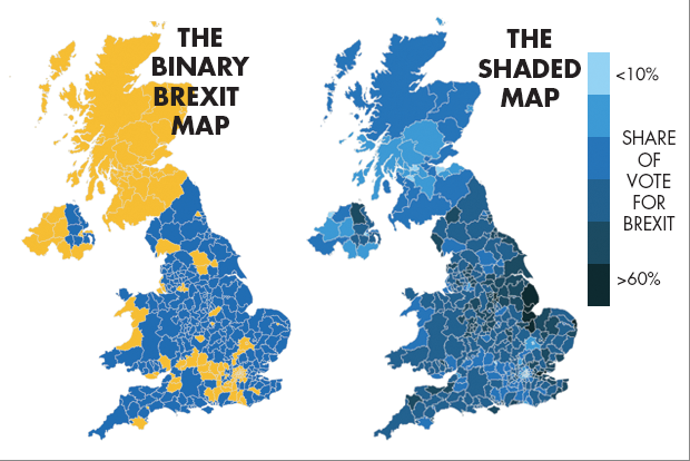
Aggregation Brexit, Bremain, the world did not end so dataviz people can throw shade and color Pick your own distortion