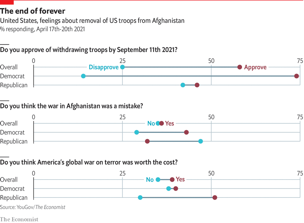
return on effort Reading this chart won't take as long as withdrawing troops from Afghanistan Kaiser deciphers a chart showing Americans' response to Biden's decision to withdraw troops from Afghanistan.
Assumptions Blood clots: is there a there Kaiser looks at the controversy over blood clots and the Astrazeneca vaccine.
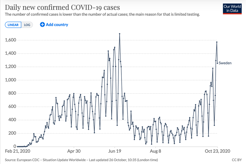
Covid-19 The Swedish mirage: the verdict is already written Kaiser asks whether we need more time to evaluate Sweden's approach to coronavirus.
return on effort Bloomberg made me digest these graphics slowly Kaiser enjoys reading the graphics in the Businessweek issue on elections.
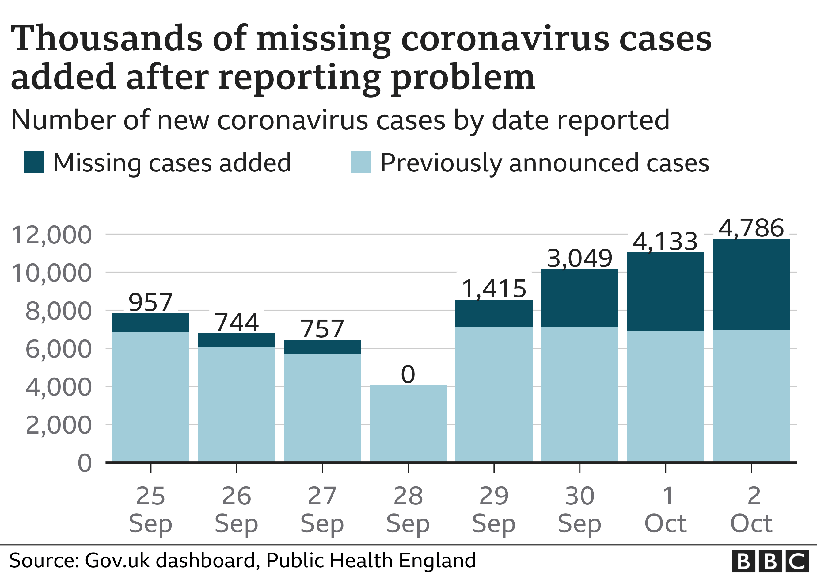
Excel Dr. Backlog jumps the pond Kaiser investigates the official reason for U.K. under-reporting of coronavirus cases.