Junk Charts
About
RSS
Posts by Year
Posts by Keywords
Sign in
Subscribe
Scale
Color
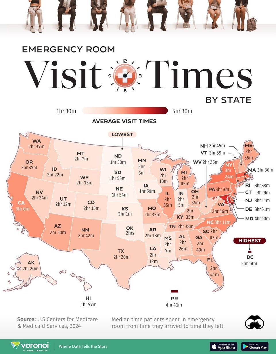
Patiently looking
Patiently looking at a map
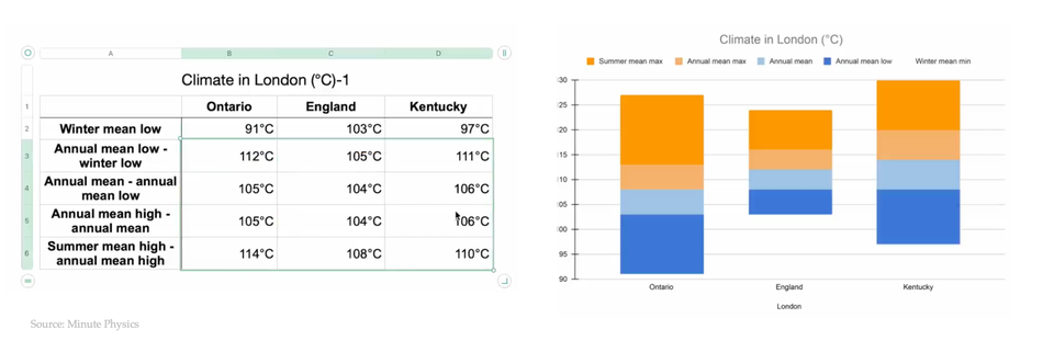
Boxplot
Five-value summaries of distributions
Using five numbers ot summarize data distributions
Color
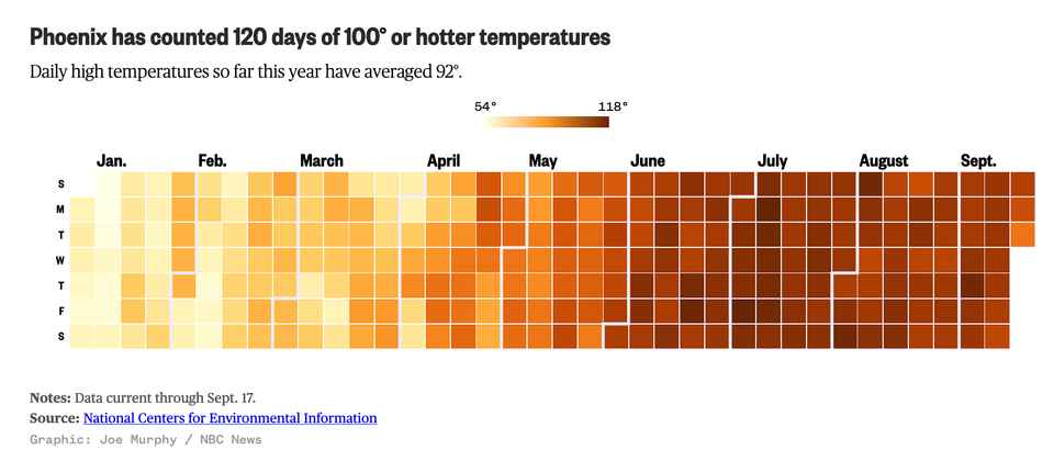
Aligning the visual and the message to hot things up
How hot is Phoenix
Axis
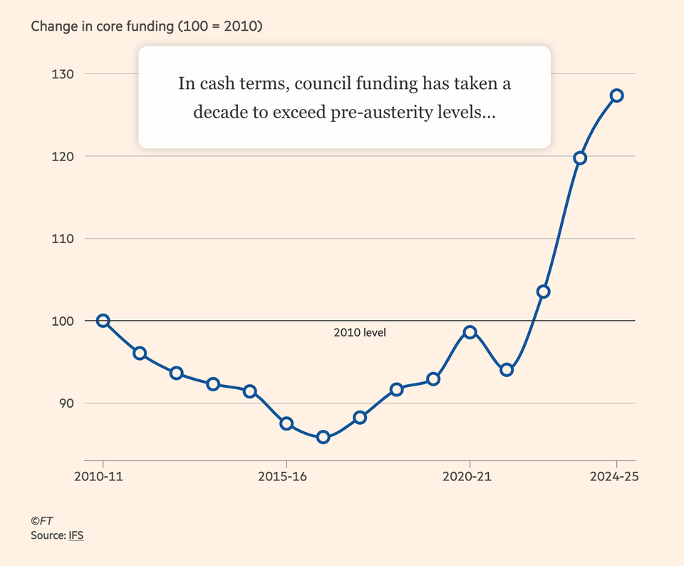
Adjust, and adjust some more
Kaiser looks at an interactive chart in the Financial Times.
Axis
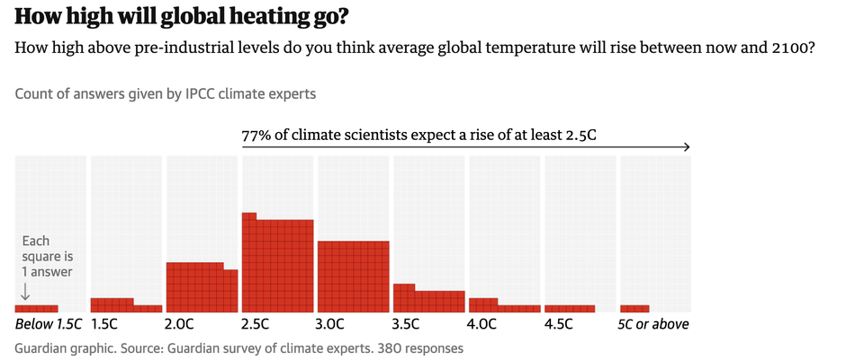
Chart without an axis
Kaiser looks at a variant of a standard chart form.
Bar chart
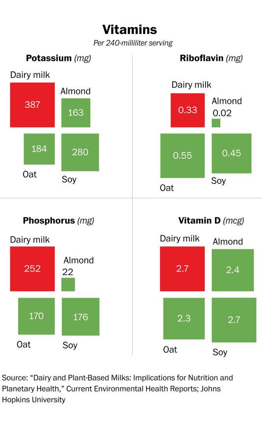
Aligning V and Q by way of D
Kaiser reads a chart comparing different types of "milk".
←
Newer Posts
Page 4 of 14
Older Posts
→