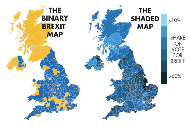
Aggregation Brexit, Bremain, the world did not end so dataviz people can throw shade and color Pick your own distortion
Aggregation Getting the basics right is half the battle I was traveling quite a lot recently, and last week, read the
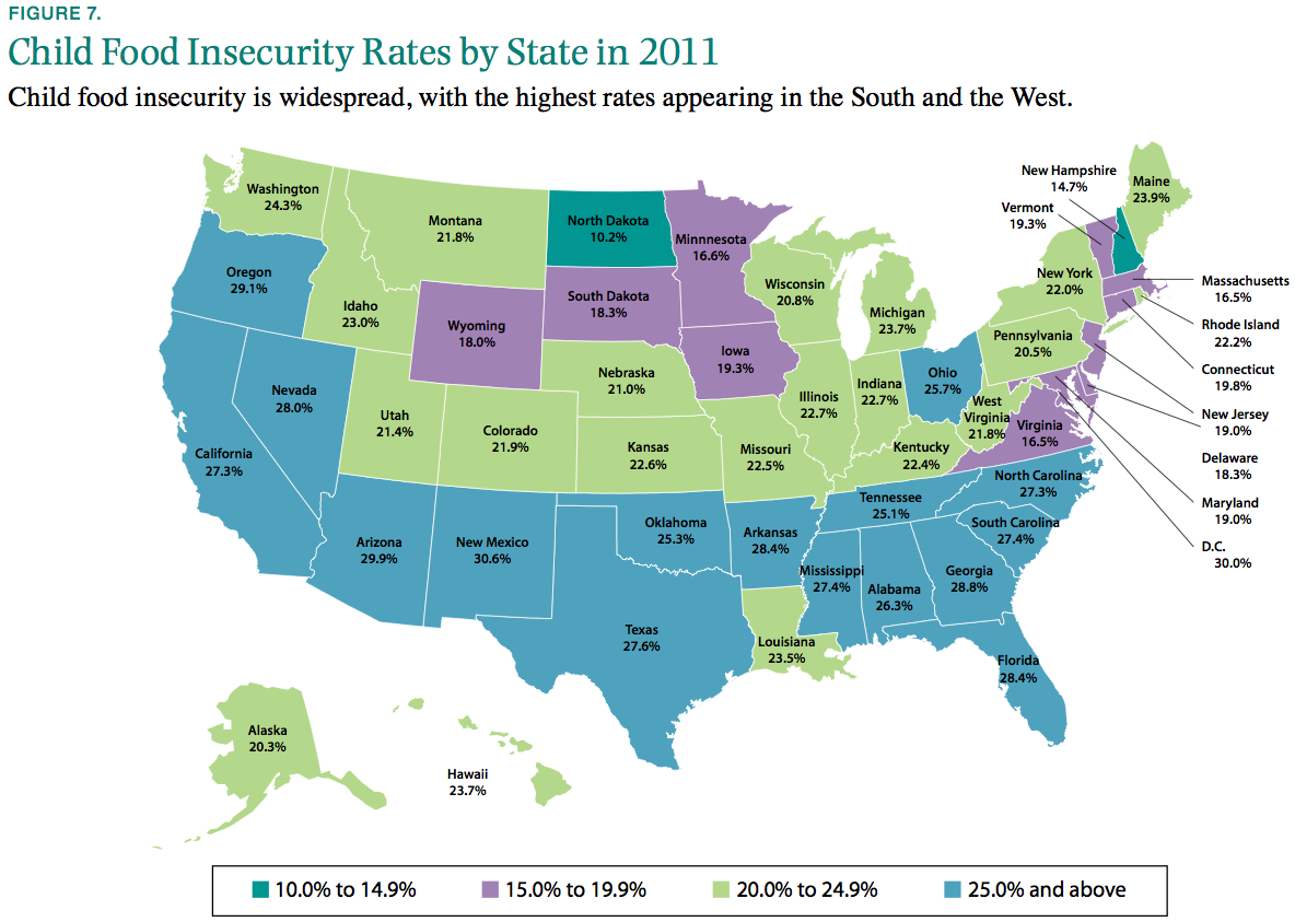
Blogs The importance of a proper scale Business Insider (link) highlighted a map showing childhood food insecurity across the