Junk Charts
About
RSS
Posts by Year
Posts by Keywords
Sign in
Subscribe
Simplicity
Bar chart
Chart cleanup
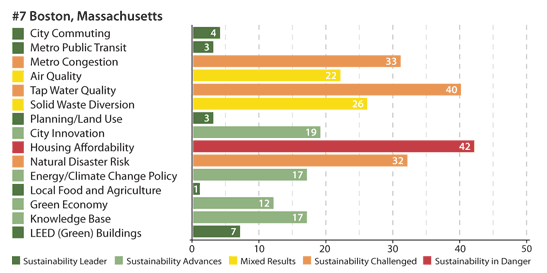
Anna E. submitted this great example from Yahoo! Green. A well-meaning chart
Color
Dizzy display
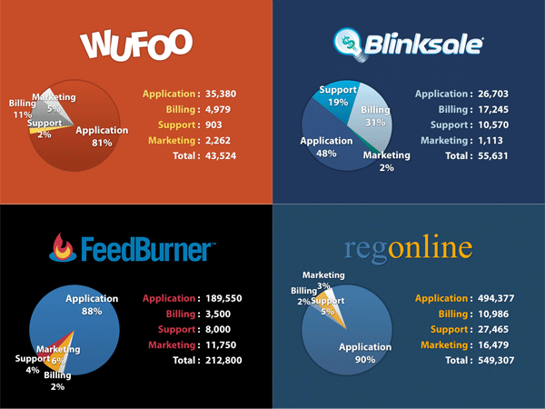
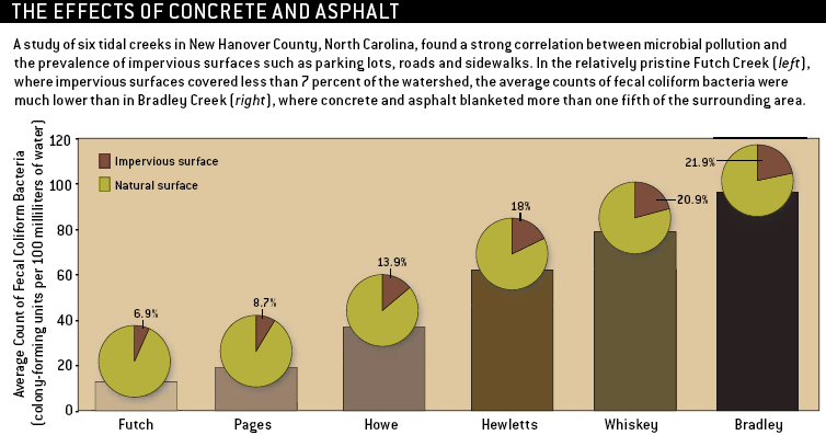
Xan G. tells us that these "inconsistent pie charts ... make [his]
Aggregation
Shower of bullets
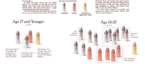
Here's one of those infographics that makes the reader work
Aggregation
Bubbles of death 2
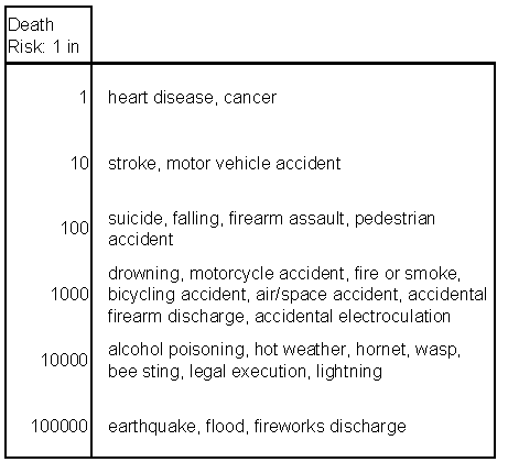
Here is an alternative way to present the death risk data. It&
Bar chart
Wading in waste
A poor graphic leaves readers wading in waste, in this case, the
Aggregation
Graphical equity 1
I've been slow checking my email lately: several of you
←
Newer Posts
Page 6 of 7
Older Posts
→