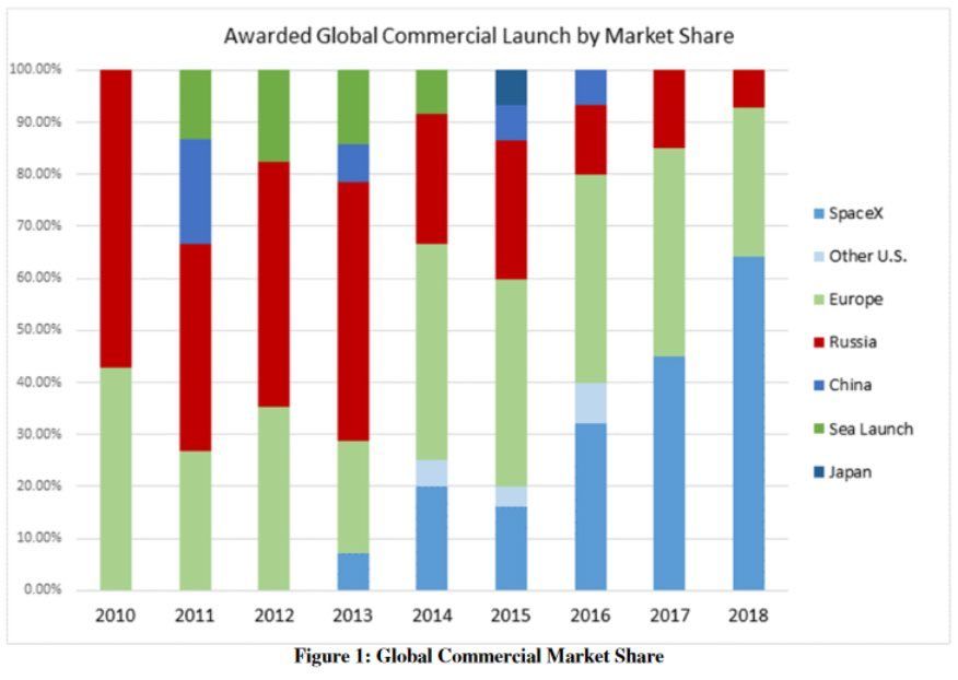
Axis Another simple Excel chart needs help Kaiser Fung, founder of Principal Analytics Prep and Junk Charts, takes apart an Elon Musk chart, created using some Excel defaults.
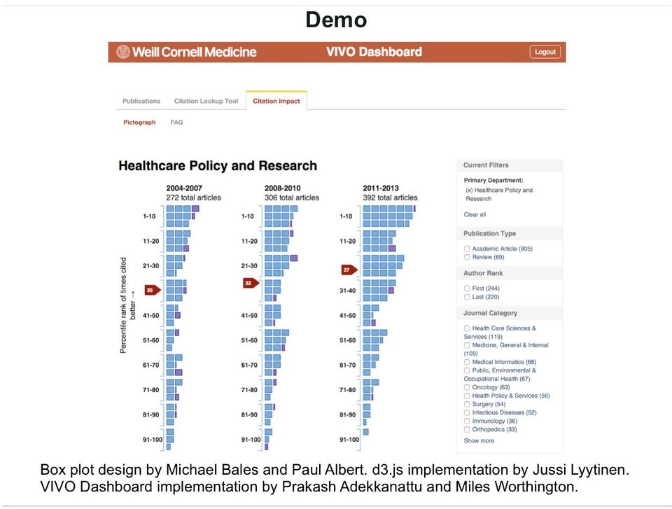
Comparability Visualizing citation impact Michael Bales and his associates at Cornell are working on a new
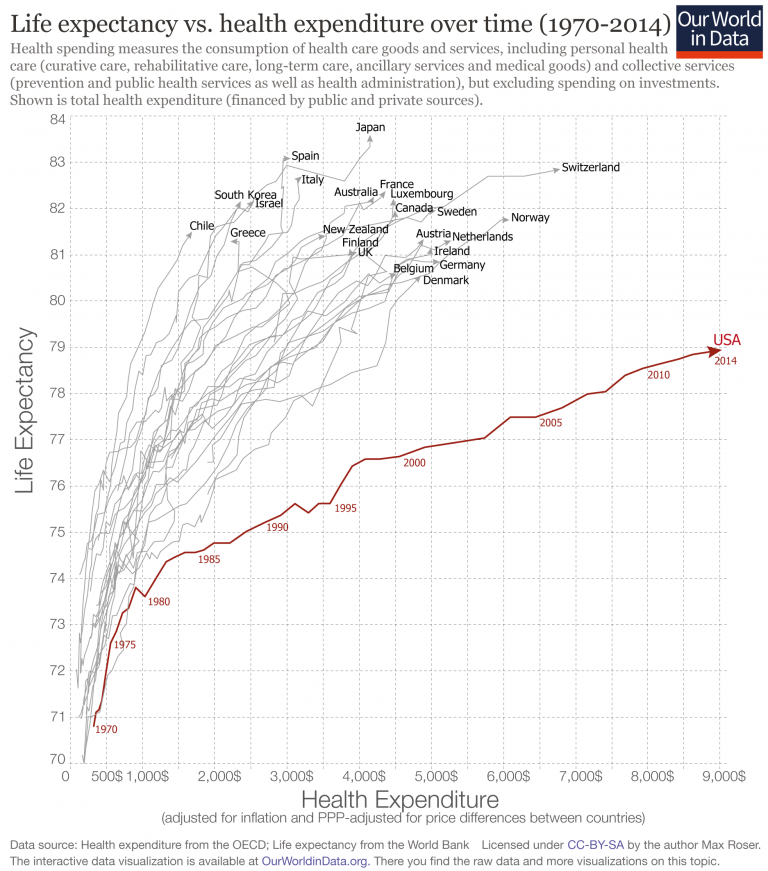
Aggregation Depicting imbalance, straying from the standard chart My friend Tonny M. sent me a tip to two pretty nice
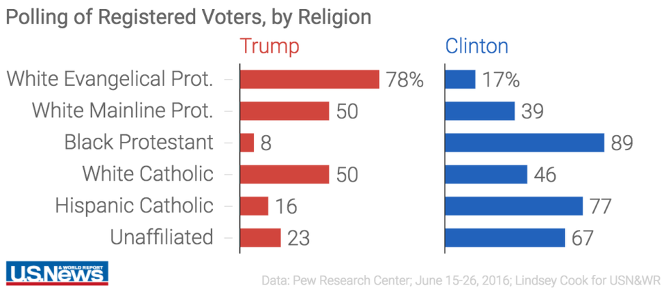
Bar chart Dot plots are under-valued, that's all Bar charts are over-used and over-rated. Just casually, I found
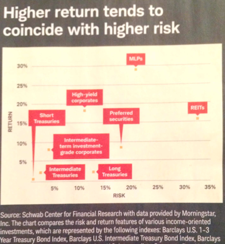
Bumps chart Where a scatter plot fails Found this chart in the magazine that Charles Schwab sends to customers: