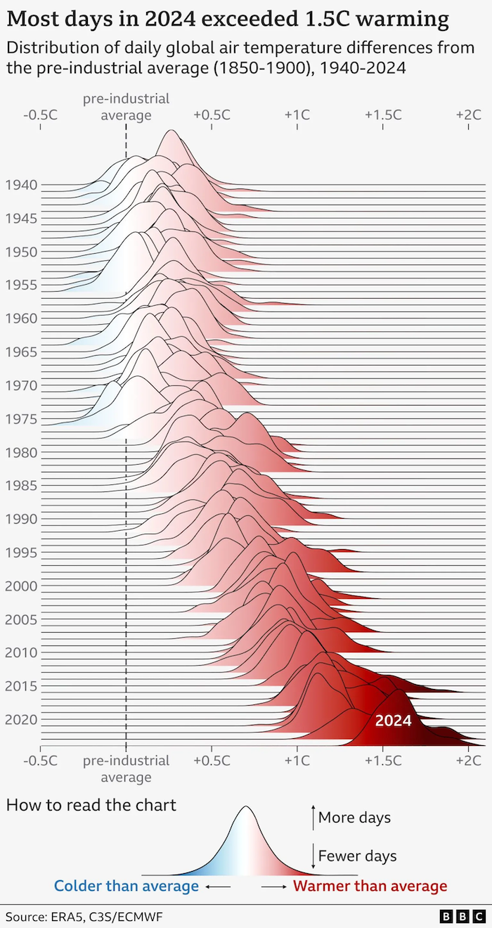
ridge plot Deliberately obstructing chart elements as a plot point These "ridge plots" have become quite popular in recent times.
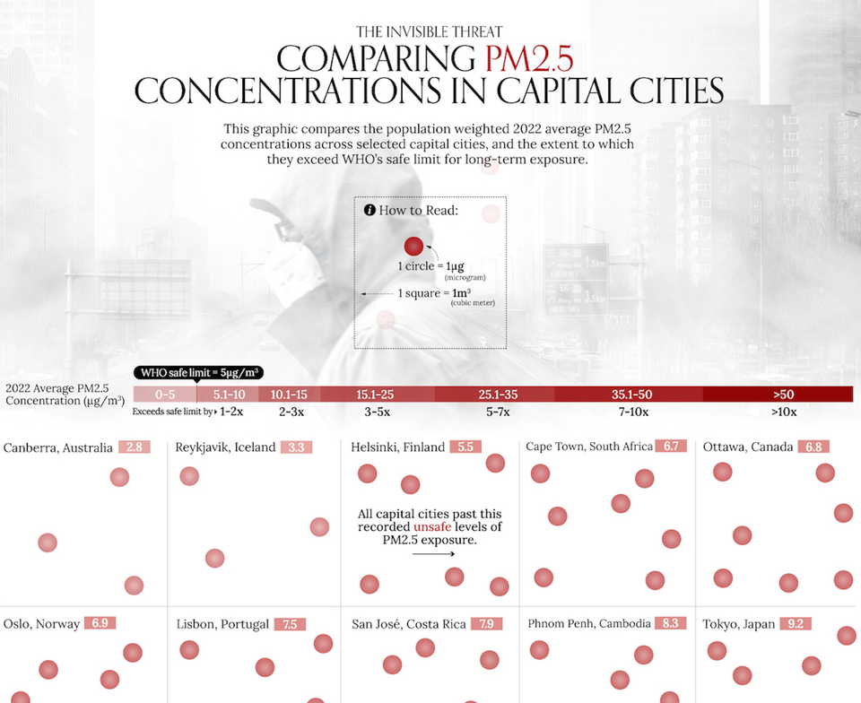
density A nice plot of densities, but what's behind the colors? Kaiser is intrigued by a plot of densities.
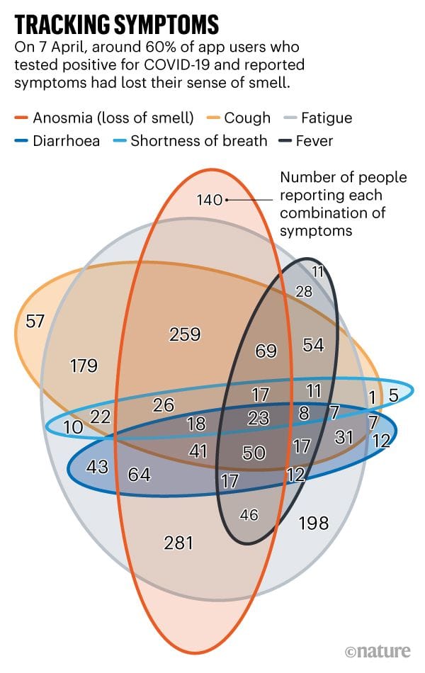
venn diagram This exercise plan for your lock-down work-out is inspired by Venn Kaiser Fung proposes a work out plan for the Covid-19 lockdown.
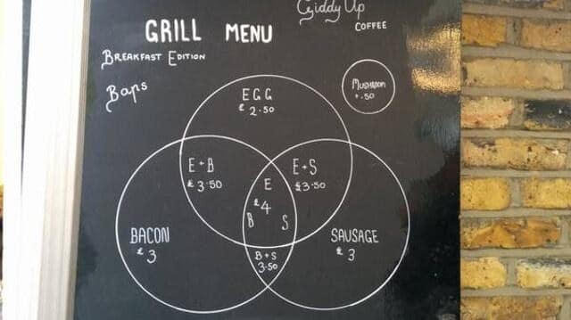
Food Foodies say, add dataviz spice please Kaiser Fung, founder of Junk Charts and Principal Analytics Prep, explains why the Venn diagram is not easy to read, and discusses some nice interesting food and beverage menus.
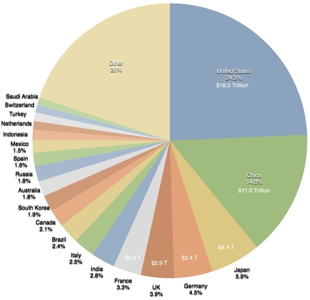
onelesspie Making the world a richer place #onelesspie #PiDay A colorful pie chart on Wikipedia, saying not much
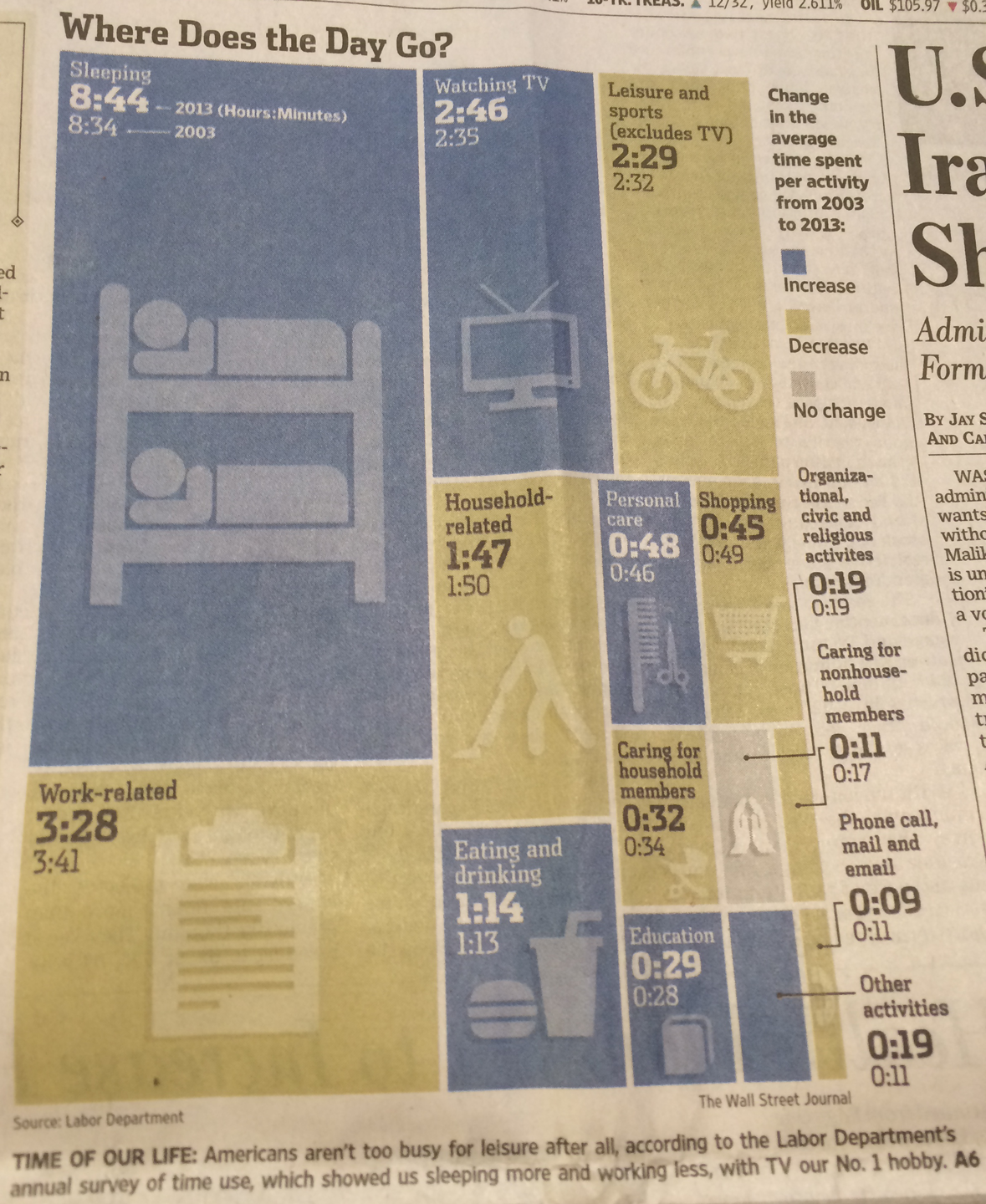
Aggregation Respect the reader's time A graphic illustrating how Americans spend their time is a perfect foil