Algorithms P esteem, bosom peril, flag to clamor, and anti-tech tech Kaiser reads about p esteems, bosom perils, and flag to clamor.
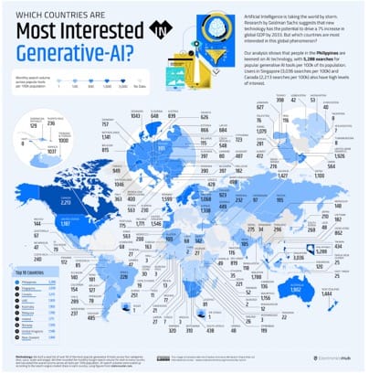
Business To a new year of pleasant surprises Kaiser finds a noisy map of the AI space. Happy new year!
ticketmaster The Taylor Swift ticketing fiasco: causes Kaiser explores potential causes of differential success rates in Taylor Swift pre-sales.
Statisticians Critics, stories, and ethics Kaiser reads an interview with the Chief Demographer of the U.S.