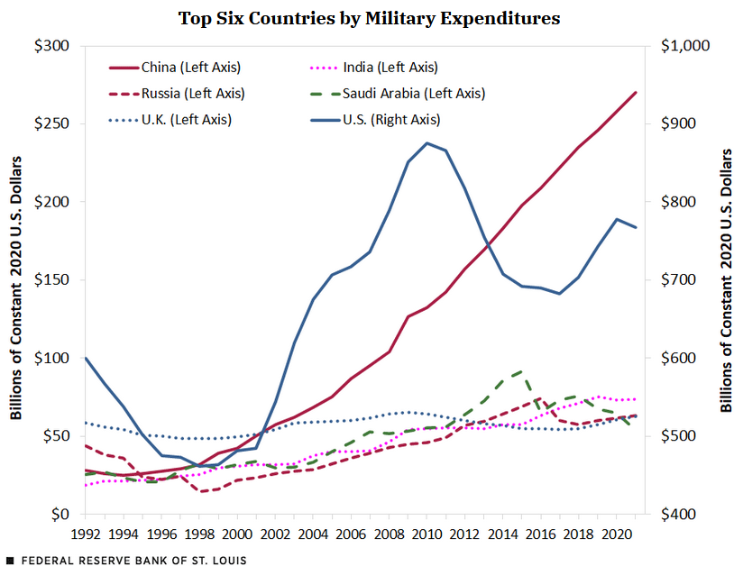
Junk Charts
  • About
  • RSS
  • Posts by Year
  • Posts by Keywords
Sign in Subscribe

Time series

Displaying convoluted indices
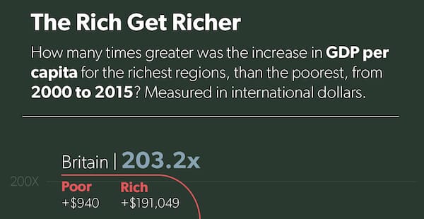
ray vella

Displaying convoluted indices

Kaiser shows how a small change in structure clarifies comparisons on a data visualization project.
Read More
Two commendable student projects, showing different standards of beauty
ray vella

Two commendable student projects, showing different standards of beauty

Kaiser discusses two dataviz projects by NYU students.
Read More
Vaccine researchers discard the start-at-zero rule
Axis

Vaccine researchers discard the start-at-zero rule

Kaiser revisits the practice of manipulating the vertical axis of a column chart.
Read More
One-dose Pfizer is not happening and here's why
vaccine trial

One-dose Pfizer is not happening and here's why

Kaiser explores what the Pfizer vaccine trial data say about a one-dose treatment.
Read More
Check out the Lifespan of News project
Aggregation

Check out the Lifespan of News project

Kaiser Fung (Junkcharts, Principal Analytics Prep) reviews the Lifespan of News project that tracks the rise and fall of news stories over time and space, using Google search data.
Read More
Excel is the graveyard of charts, no!
Bar chart

Excel is the graveyard of charts, no!

Kaiser Fung, creator of Junk Charts blog and founder of Principal Analytics Prep, encourages Excel users to work harder at making nice data graphics.
Read More
← Newer Posts Page 9 of 20 Older Posts →
Junk Charts © 2025
  • BOOKS
  • COURSES
  • PRESS
  • CONSULTING
  • COACHING
  • CONTACT
Powered by Ghost