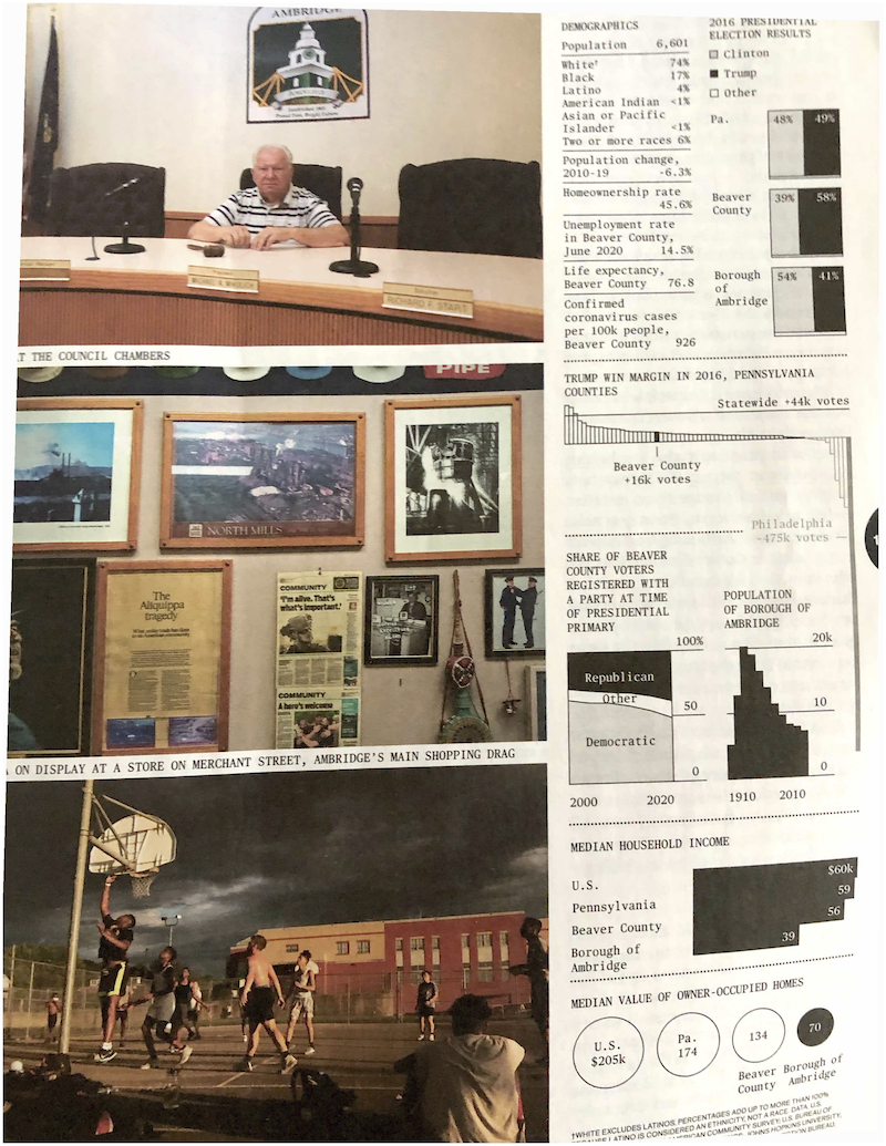
return on effort Bloomberg made me digest these graphics slowly Kaiser enjoys reading the graphics in the Businessweek issue on elections.
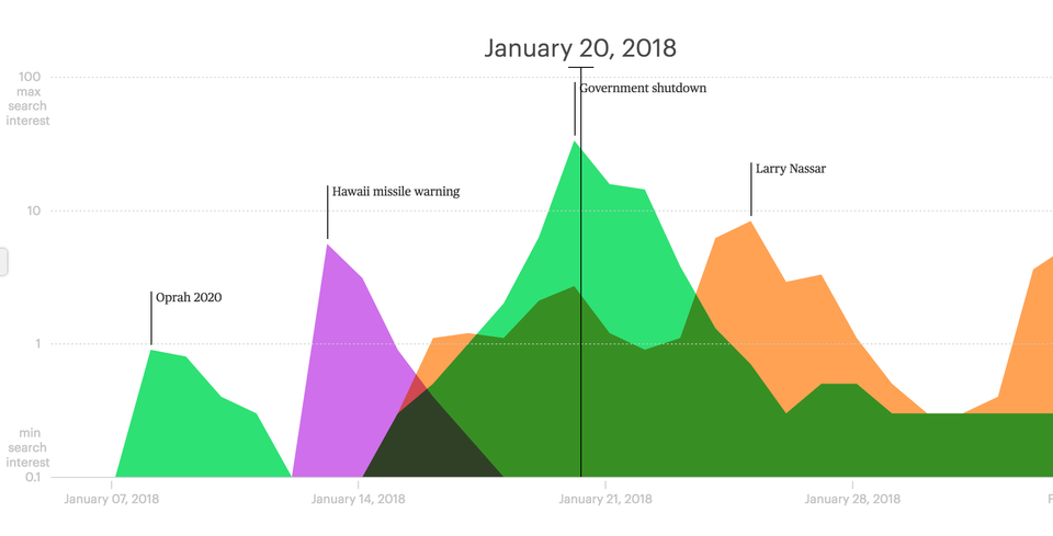
Aggregation Check out the Lifespan of News project Kaiser Fung (Junkcharts, Principal Analytics Prep) reviews the Lifespan of News project that tracks the rise and fall of news stories over time and space, using Google search data.
ray vella Diverging paths for rich and poor, infographically Reviewing a creative data visualization from Ray Vella's class
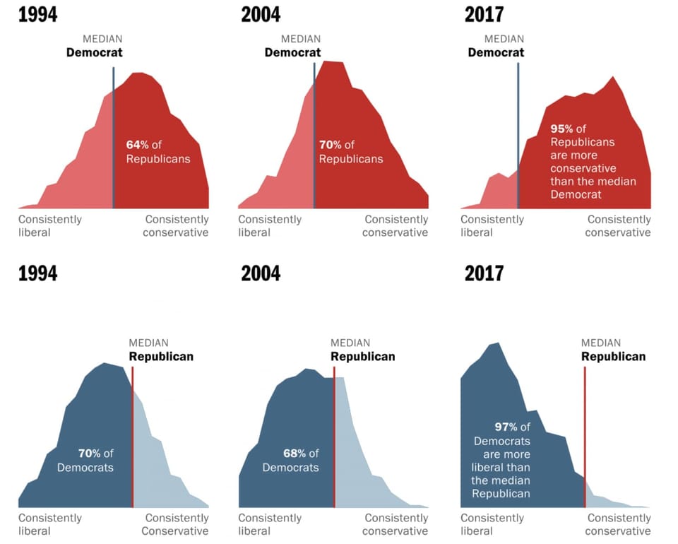
Area chart Let's not mix these polarized voters as the medians run away from one another In-depth look at Washington Post's fantastic feature on median U.S. voters
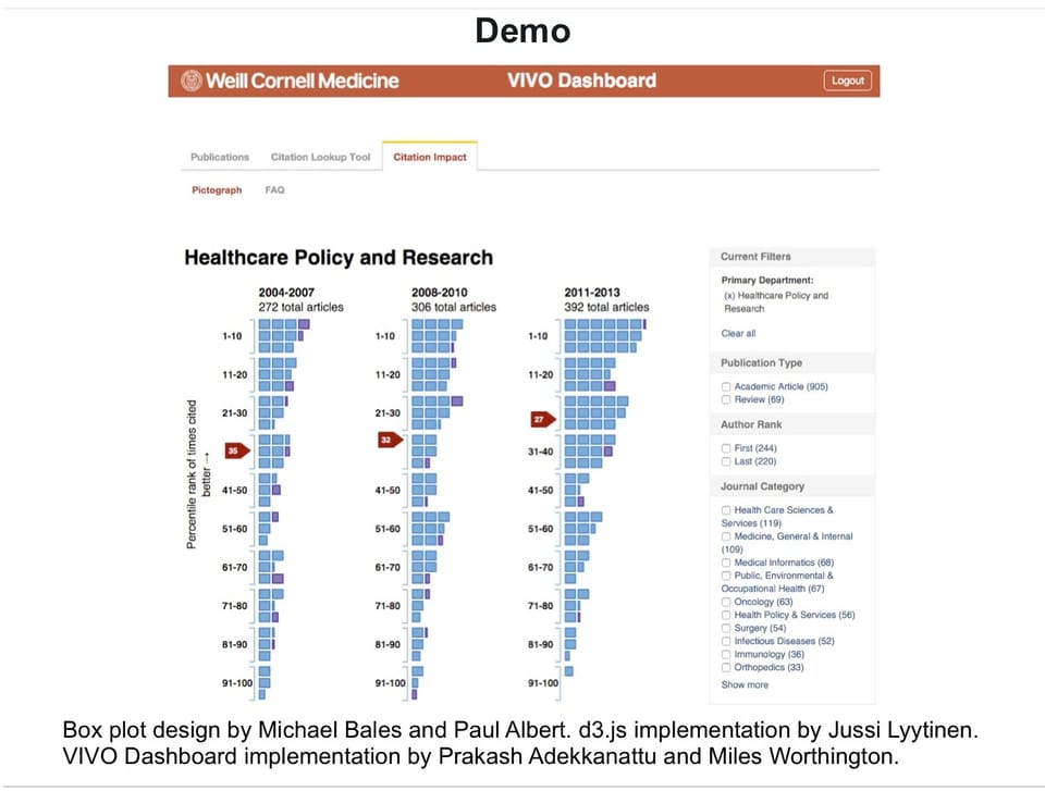
Comparability Visualizing citation impact Michael Bales and his associates at Cornell are working on a new