Analytics-business interaction Know your data 34: coming for your most private data Kaiser reacts to news that hospital websites push personal health data to Facebook.
Analytics-business interaction Know your data 33: oops the dog did it Kaiser reads Twitter's admission of misleading users on two-factor authentication.
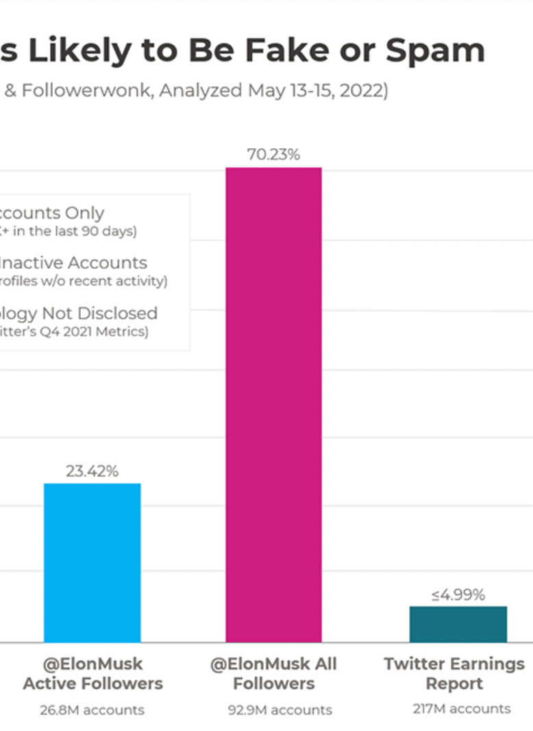
Algorithms Are 81 percent of Elon Musk's twitter followers fake? Kaiser reads an estimate of Musk's spam proportion.
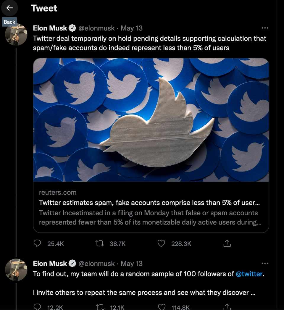
Aggregation The Musk sampling plan, thought through Kaiser examines Elon Musk's plan to find out what proportion of twitter users are spam.