Ten pie charts. Are you worried yet?
Ten pie charts about American worries
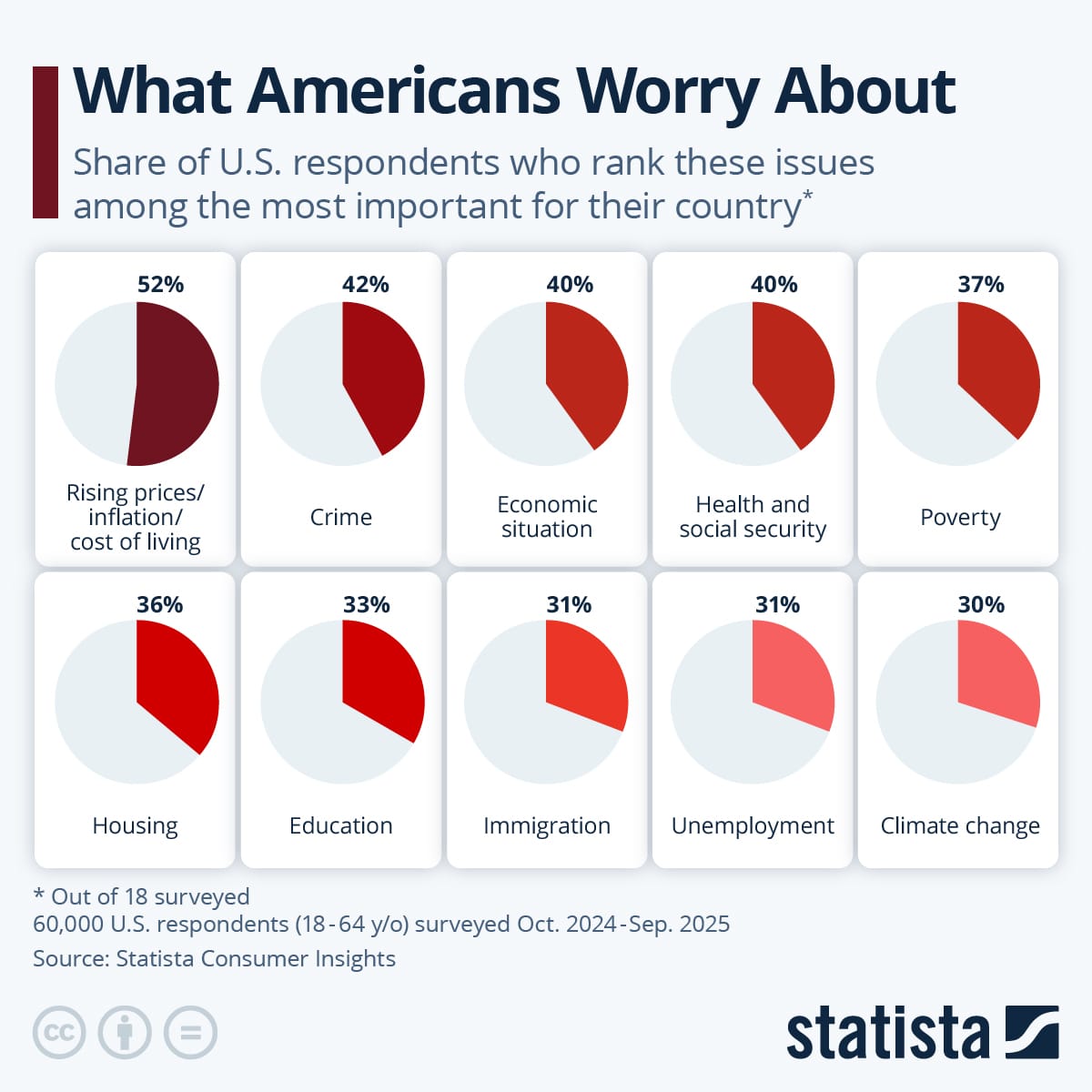
Statista published this series of pie charts that illustrate results from a survey asking Americans what they are worried about (link). The survey question has 18 options, while the chart covers the top 10 issues. "Top" is defined by the proportion of respondents who ranked the issue as their topmost concern.
The chart form is a small multiples of pie charts. Each pie chart addresses a specific issue, and contains one data point – the proportion of people who ranked that issue as their top worry. The data series is encoded twice, first in the area (or angle) of the sector, and also in its color.
This chart fails our self-sufficiency test. If stripped of the data labels, we are left with:
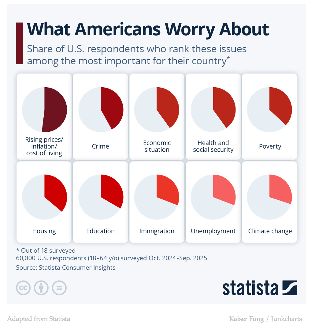
It takes some effort to figure out the proportion of each sector. It also shows the minimal contribution from the use of color. Using color alone, no reader can possibly learn the data in any of these pie charts.
It's not clear to me that the color assignments were applied using a formula. The change between Immigration and Unemployment on the second row is quite noticeable, and feels larger than the change between Health and social security and Poverty on the first row. Yet, the former is a fraction of a percent while the latter represents 3 percent.
Here is a bar chart showing the same data:
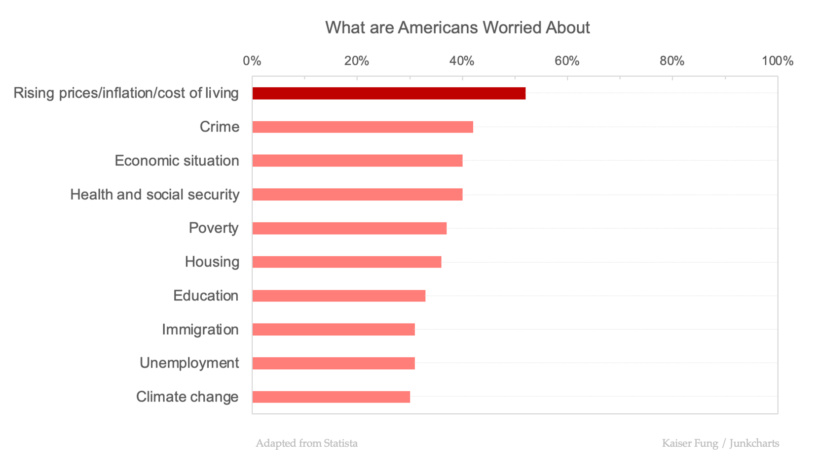
I like to extend the axis to the full 100 percent, making it easier to judge the length of each bar, as a proportion of the total.
I chose only two shades because the gaps between successive data points are modest for the most part.
The bar chart does not require printing the entire dataset to be understood.