The case of the shrinking mall
I had a similar reaction when reading this chart but I will let our reader take center stage.

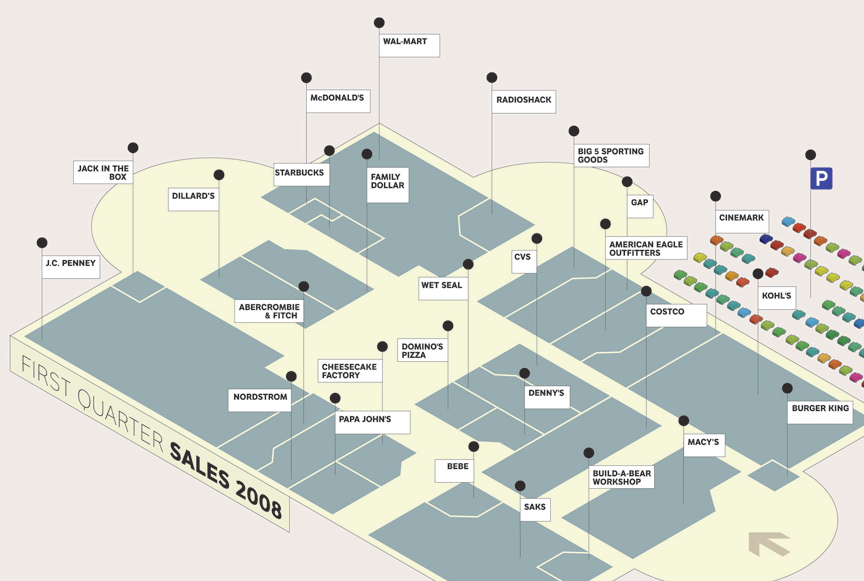
Top portion
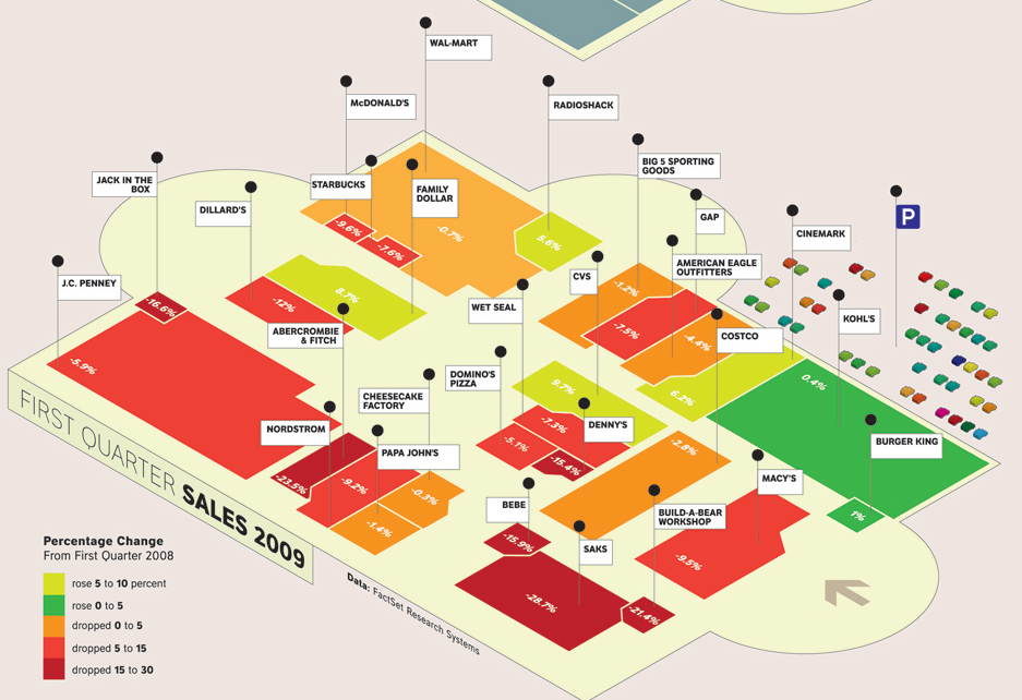
Bottom portion
The back of today's New York Times' Week in Review section devotes half of its space to a lame infographic that wastes space and has a major error (which has been corrected lazily in the version now online at http://www.nytimes.com/interactive/2008/10/14/opinion/20090531_OPCHART.html ) The chart shows the recent decline (or in some cases, rise) of retail sales at 27 common mall chains. My main objection is that the top half of the chart is useless. Yes, it provides a baseline from which shrinkage in area (visual metaphor of income = floor space) in the bottom half can represent the relative declines in sales, but this is redundantly handled better by color. The only part of the chart that I got any information from was the bottom half, and it took me a while before I figured out why the top half was even there. Meanwhile, the error in the printed version is that the +5-10% stores were colored light green while the +0-5% store (Burger King) was colored dark green. It should have been vice-versa. The online version simply swapped the colors in the legend, rather than on the map itself, which works logically but begs the question: why do you have dark red at one end of the spectrum and light green at the other, with dark green in the middle? Thank you for listening-- just blowing off a little steam here. It's a lot of wasted space and I'll bet the New York Times paid a lot for it.
Reference: "Op-Chart: The Fall of the Mall", New York Times. (Ed: I am not sure why the date is given as October 2008.)


