The chart that reveals a mysterious death
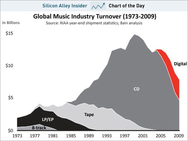
I agree with Business Insider that the following chart is attractively drawn. It nicely illustrates the rise and fall of various music media over time.

Area charts are more visually appealing than line charts, largely because line charts frequently leave large patches of white space. But one should be aware of some shortcomings of area charts.
Notice that the outer envelope of the area chart represents the growth in music sales across all media, not to be mistaken for the growth of any particular media. However, the primary message of this chart relates to the change in mix among different media, not the growth of the total market. Because of the stacking of different areas on top of each other, it is not an easy task to read the growth of any individual piece, such as CDs.
***
Unlike Business Insider who found some answers on this chart, I find that this chart raises a mysterious -- and important -- question: what happened around 2001 to damage CD sales? Since according to this chart, digital sales didn't really show up till 2004-ish, there is a gap of two years or so when CD sales dropped drastically, seemingly of its own volition.


