The eyeball test
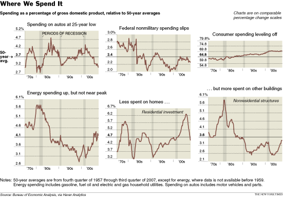
This set of graphs was used by the NYT to discuss changes in U.S. spending patterns over time. For this post, I am focusing on the bottom left and bottom right graphs. One shows spending on energy as a percent of GDP; the other, on "nonresidential structures" (aka, commercial buildings).

At first glance, spending on energy and that on commercial buildings look very similar in shape (see above or below left). Alas, this "eyeball test" doesn't work very well with time series data. Lets investigate further.

"Standardizing" the data (above right) tells us whether the swings are unusual or not in the history of the data. So in the 1980s, commerical building spend spiked to more than three times the standard deviation above the historical average. Generally speaking, the standardized unit of 3 is taken to mean highly unusual.
Notice that the peaks of the left graph had equal heights but on the right graph, energy spending peaked only above two while commerical building spend rose above three. This is because energy spending has been more volatile historically so it takes larger jumps (or plunges) to count as "unusual" movements. This information is hidden in the unstandardized version.
Further, since we are concerned with long-term trends, lets take a look at five-year moving averages (below right): in other words, each time point is the average of the preceding five years worth of data.

The fluctuations have been smoothed out and the peaks are no longer as high. Glancing at this chart, we may still conclude that the spending patterns are quite similar -- especially in the period prior to 1995.
But is that really the case? Zooming in on the 1980s, we may mistakenly think the two lines are "close together" if our eyes read the horizontal distance and/or area between the curves, rather than focusing on the vertical distance. The arrows on the bottom left chart depict this difference. To make things clearer, the bottom right chart plots the vertical distances between the two lines.

Observe that the difference expanded to above 1 unit in the late 1980s. A difference of one unit is very large in the standardized scale (of "unusualness") since 0 is business as usual and 3 is "highly unusual".
Eyeballing the two time series would lead us to believe that the two series are similar but we run the risk of underestimating the differences as illustrated here.
Source: "Auto Sector's role Dwindles, and Spending Suffers", New York Times, Nov 3 2007.


