The inutility of stacking columns
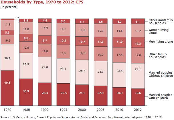
When I see a stacked column chart like this:

(via Andrew Sullivan)
I immediately want to remake it as a line chart, like this:

The decline in households with two parents and children appears more dramatic in the line chart, primarily because it has the right spacing of time.


