Cram it like Koby
You have to gradually build up your gut by eating larger and larger amounts of food, and then be sure to work it all off so body fat doesn't put a squeeze on the expansion of your stomach in competition -- Takeru Kobayashi, six-time champion of the Coney Island hot dog eating contest
Kobayashi is a phenom. He can stuff 60 hot dogs or 100 burgers in ten or twelve minutes and show no consequences. Ordinary people can't hope to emulate these feats.
Junk Charts sees Kobayashi as a hero; an anti-hero really. We are ordinary people; we can't hope to cram it like Koby. A message we keep repeating here is: too much data sinks a chart.

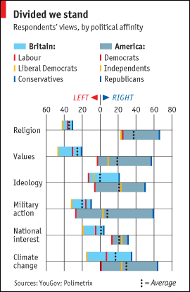
Not long after this chart showed up in the Economist, several readers urged us to take a look. It's a well-nourished chart indeed, one to challenge Kobayashi, but for all that it contains, the reader has to try very hard to find insights. What with the multiple colors, iron-fisted gridlines, above-and-below boxes, dotted and solid lines, and a legend with nine pieces split in two spots? Besides, the U.S. boxes grab all the attention by virtue of them being wider (country being more partisan).
The key to unraveling this chart is to identify the relevant comparisons:
- UK average vs US average
- UK left vs US left
- UK right vs US right
- UK independent vs US independent
And then for the gluttonous:
- UK right vs US left
- UK left vs independent vs right
- US left vs independent vs right
In the junkchart version, we address these comparisons sequentially.

(Apologies for the tiny font.)
We are again using a small multiples approach that places four comparisons next to each other: average, left, independent, right. Consistently, the British is to the left of Americans. The only places where the two cultures meet are where liberals agree on "ideology" and "military action".
Also note that we use a symmetric horizontal scale centered at 0. There are too many charts out there where the center is not at the center!
A similar presentation addresses the other three comparisons. Democrats in the U.S. are miles to the right of Tories in terms of "religion". In the UK, Labor and Tories are not much different except on "ideology". In the US, Independents lean closer to Democrats.

Joining the lines (I hear the grumbles) helps bring out the gap between the groups being compared. Without lines, the chart would look like this.

It is often hard to keep track of which dot is which as they trade order from issue to issue.
PS. Anyone knows what is being measured on the horizontal axis? The original graph mysteriously stated "respondents' views".
References:
Eric Talmadge: "Pigout champion Kobayashi limbers up for hot dog gold" June 25, 2004
"Anglo-Saxon Attitudes", Economist, Mar 27 2008.


