The meaning of most
Megan McArdle started the war on infographics (link). And reader Danielle A. contributes this example, from KissMetrics.

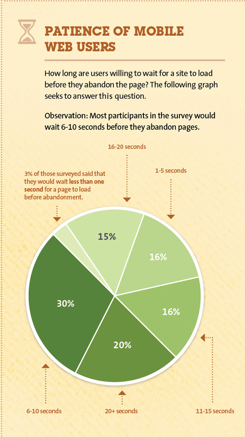
This is one part of a big infographics poster. Needless to say, a bar chart renders this data much better:

The categories are sensibly sorted, and useless tinges of color removed.
***
But I want to draw attention to their conclusion:
Most participants in the survey would wait 6-10 seconds before they abandon pages.
Now we know writers of opinion pieces in the major newspapers have long lost control over the titles of their pieces. Is it true that graphic designers have ceded control over their conclusion statements?
It would appear so. The category being labeled as "most participants in the survey" accounted for 30% of the respondents. When is 30% considered "most"?
Also, surveys are typically tools for generalization so we expect conclusions about the general population of mobile users. Here, whoever wrote this conclusion timidly restricted the remark to "participants of the survey". This is probably an oversight because in other panels, they talk about x% of consumers or y% of mobile internet users. If the survey was probably designed and executed, they should be confident about the whole population, not just the sample.
Finally, nowhere on this poster can you discover which survey this data came from. We have no idea what the sample size is, nor the margin of error.


