The right scale
Oftentimes, picking the right scale for a chart makes all the difference. The following chart showed up in the New York Times Magazine some time ago. Readers will immediately recognize this as "infotainment" rather than a serious attempt to convey the data.

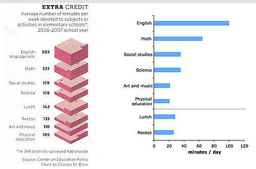
The data came from a study by the Center on Education Policy which counted the amount of instruction time spent on various subjects at a sample of elementary schools in the U.S.
A simple bar chart would make a nice graphic, as shown on the right. Instead of sorting by decreasing minutes, we pulled out "lunch" and "recess" since they belong to a separate category.
Our main focus, though, is on the scale. The original report - and thus the original graphic - used minutes per week. We contend minutes per day (or even hours per day) to be more user-friendly. This is because any number makes sense only in comparison to other numbers. There is no easy reference to a number such as 500 minutes per week. However, being told it's 100 minutes per day (or 1 hr 40 min per day) means a lot because everyone knows there are 24 hours in a day.
This is a small example of a larger problem with using averages. The media loves to give out statistics like six people are dying of diabetes every minute (e.g. here). This is typically done by dividing the total number of diabetes-related deaths in a year by the number of minutes in a year. Why divide by total number of minutes in a year? The fallacy of such a calculation is evident if one applies this logic to natural deaths (since we all have to die some day). As the world population grows, there will just be more and more people dying every minute!
Choosing the appropriate reference point -- just like picking the right scale -- is the beginning of any good analysis.
Reference: New York Times magazine, April 27 2008; Center on Education Policy.


