The Tufte count
One of the things I picked up from Tufte is the horrible habit of counting the amount of data on a chart. This is part of the info gathering to estimate the data-ink ratio (amount of data divided by the amount of ink used to depict them).
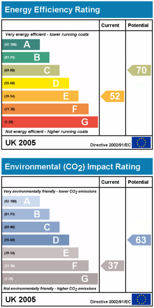
Leon B, a reader, left this in my inbox, months ago it turned out. This is the British government's way of informing people how energy-efficient their homes are. As Leon said:
these charts might be a great example of governments going overboard with colours, bars, letters and numbers and lines for something that really only has four data points.

In addition, I find the use of two different scales to be confusing and unnecessary. If it is decided that scores in a particular range can be grouped as A, B, ..., G, then the original scale should be discarded. 52 is E and 70 is C. (This is especially so since the score ranges are not intuitive, like 69-80 = C ?!)
Even worse, what's the point of citing the 0-100 scale without explaining what is the metric?
A table presentation does a far better job in a fraction of the space:

Source: Home Information Pack, UK Government. Graph from Wikipedia.
PS. This post set off a torrent of emotions (see the comments). Another version that I discarded was the simplest table possible. In my view, there is still way too much distracting "junk" in the original design. No one has yet explained why the 0-100 scale should be emphasized, or what it means!


