Turning in his grave 1
(Thanks to reader Josh R. for the tip.) The "plucky statisticians" at Urbanspoon decided to tackle the political hot potato: is Barack Obama an elitist? Scratch that -- what they actually did was to determine if Obama supporters were elitists (of course, Obama would then be, due to guilt by association.) Scratch that -- what they actually analyzed was if there tended to be more Starbucks per capita in those states in which Obama won Democratic primaries.
Suffice it to say, even if it can be proven that most states with high densities of Starbucks are more likely to have more Democratic primary voters who prefer Obama to Clinton, it is a far cry from proving Obama an elitist. However, we take the leap of faith and look at the evidence presented to us.

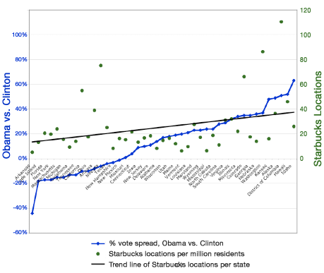
The star witness was this chart plotting the "vote spread" of Obama minus Clinton and the per-capita Starbucks density. The black line was a linear fit to the Starbucks data as shown in green dots. Since the black and blue lines both pointed northeast roughly speaking, we were told: "States with more latte-purveying Starbucks stores are more likely to have gone for Obama." (So Obama is indeed an elitist.)
To cover all bases, the creator of this chart suggested that "my statistics professor might be rolling over in his grave to hear me say it, but there's a mild but real correlation here!".
Mr. Urbanspoon, the statistics professor is here and he disapproves. As discussed before (and here), plotting two series of data on the same chart and applying two different scales is a recipe for disaster. Not reaching immediately for the scatter plot when one has two data series is another serious misstep. (Indeed, Josh sent the link in with a note wondering why "people dislike scatter plots so much".) So here is the appropriate graphic:
A quick first glance at the left chart indicates that any correlation, if it exists, is very weak indeed. A simple linear regression analysis shows that Starbucks density explains only 14% of the variability in vote spread. Note especially the wide dispersion of dots around the line. Further, for the vast majority of the states (say those with vote spread between -20% and 40%), there appears to be no correlation. This is seen on the right chart.

To the extent that there is a linear correlation, the points (orange dots) would be most influential. The top cluster included Alaska, Kansas, DC, Hawaii and Idaho in which Obama had a large winning margin while the Starbucks density was above average. The bottom cluster included Arkansas and Olkahoma where Obama was wiped out and where Starbucks had the lowest density. These two clusters alone explained the mild relationship; removing them wiped it out.

Following Nyhan, we should remove some obvious outliers, such as Arkansas, Illionois and New York (home states), Michigan and Florida (disputed) and New Hampshire and Iowa (Edwards territory). The result is also mild correlation (R-sq = 0.075).
Till next post, when the professor rolls over again ...
Notice that I prefer the number of people per Starbucks metric, as opposed to the number of Starbucks per thousand people (See prior discussion on Gelman's blog.) The reason is that every number on the former metric is reality-based while the latter metric produces imaginary numbers for small states, i.e. the imputed number of Starbucks is smaller than what actually exists!
Also note that I used a renormalized vote spread so that the Obama proportion and the Clinton proportion added up to 100%. This made the assumption that Edwards and other voters would split among Obama and Clinton in the same proportions as those who explicitly voted for the two frontrunners.


