Turnout tuneout
A clever scatter plot reveals an interaction
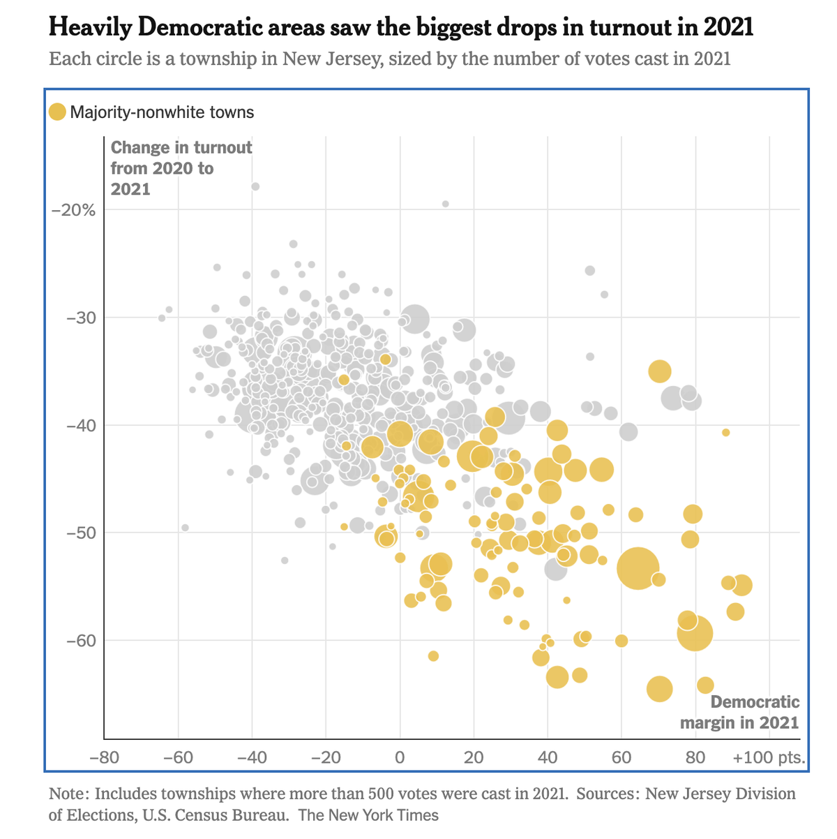
I enjoy the scatter plot published by the New York Times team about New Jersey's elections (link; paywall).
On this plot, each dot represents a "township" (with at least 500 votes cast in 2021). The yellow dots depict "majority non-white" towns; based on the accompanying article, the driving force are Hispanic voters. The gray dots, unlabeled, show the majority white towns.
When the analyst classifies the towns in this manner, a clear pattern emerges. Almost all the yellow dots are found in the lower right quadrant while the gray dots cluster in the upper left of the chart. The data tell a compelling story; what is it?
The backdrop of the chart are two successive recent elections: the 2020 Presidential election, and the 2021 state Governer's election. The horizontal axis shows the vote margin in the 2021 election: the right side (of zero) represents the towns Democrats won while the left side (of zero), where Republicans won. It's not surprising that the Democrats are stronger in the majority non-white towns; almost all the yellow dots are on the right side of zero. (Much of the NYT article concerns the shift of Hispanic voters towards Trump in 2024 but this isn't the story of this scatter plot.)
The vertical axis shows the drop in turnout from 2020 to 2021. The change was dramatic, ranging from about -20% to above -60%.
The story: the vast majority of the gray dots lie above the yellow dots. This means that the tuneout was much more severe in the majority non-white towns relative to the majority white towns. Add to that, the Democrats' strongholds are majority non-white towns. So, the turnout of Democratic voters deteriorated much more than that of Republican voters. We expect the Governer's margin of victory to be much smaller than the President's.
Lurking behind this scatter plot are four quadrants, with most towns found in two of the quadrants.
It's easy to delineate the left and right sides: just use the 0% voting margin divider so that left are Republican towns while right are Democratic towns.
How about the top and bottom divider? Here, I can find the average change in turnout in the whole of New Jersey. This turns out to be 40% - 72% = -32%.
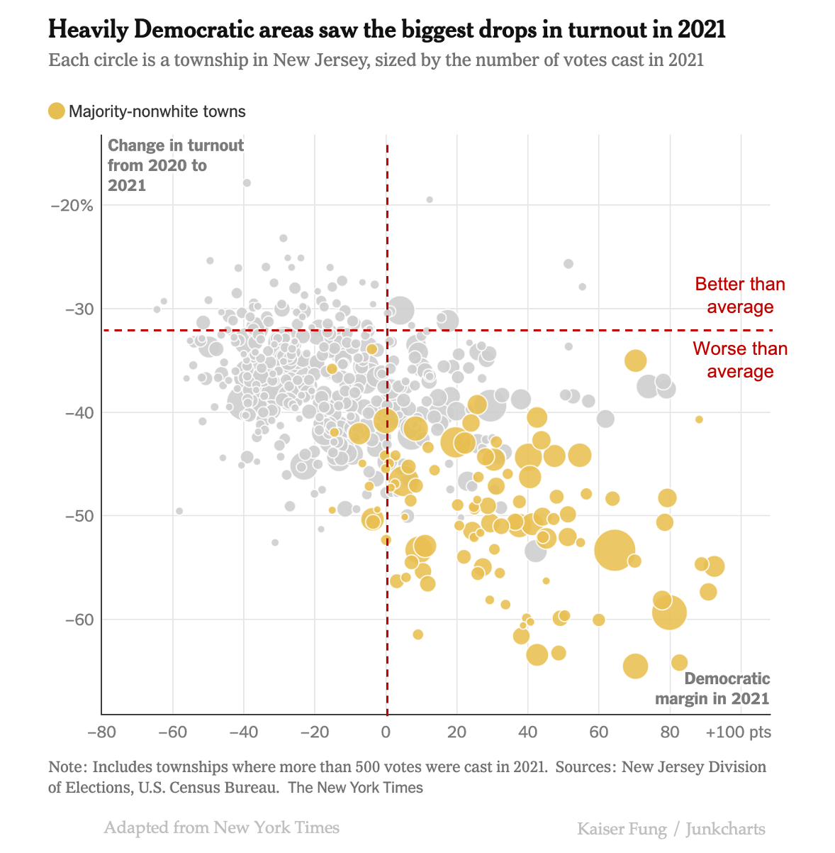
The location of the average turnout drop is a bit odd. It makes me wonder if NYT is using a different data source. I'd have expected the line to sit lower since the large dots are mostly below the line, and in addition, the pile of small dots also appears below the line.
What we just observed is an example of an "interaction" effect. The observed data result from the simultaneous operation of two effects. We cannot artificially impose "change one while keeping the other constant."
Effect 1 is the correlation between vote margin and race; majority non-white towns skew Democrat. Effect 2 is the correlation between vote margin and change in turnout; towns with larger turnout drops skew Democrat. Both effects are driven by the Hispanic voters so they happen simultaneously.
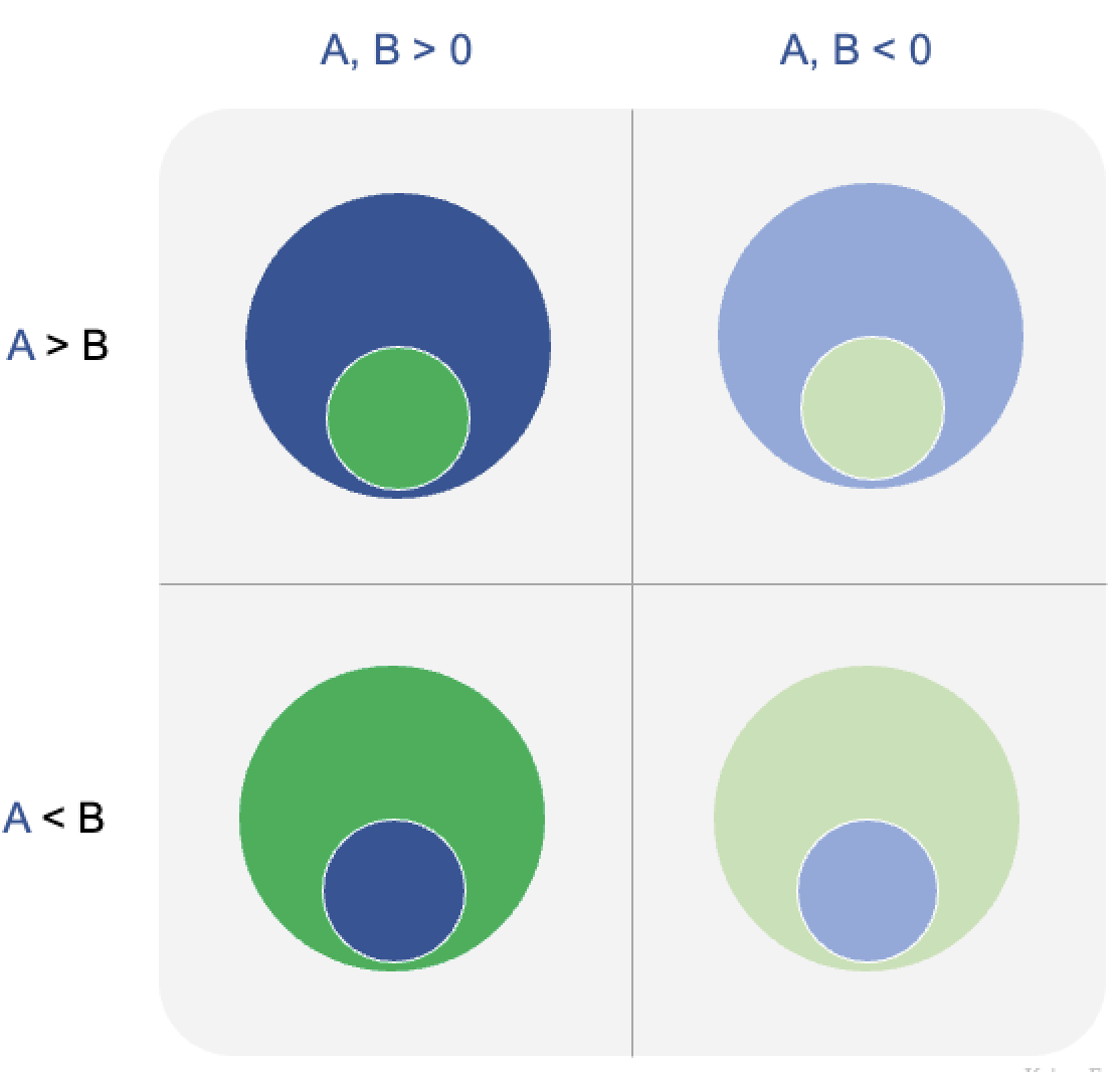
Let's see what we should observe if only one of the effects exists.
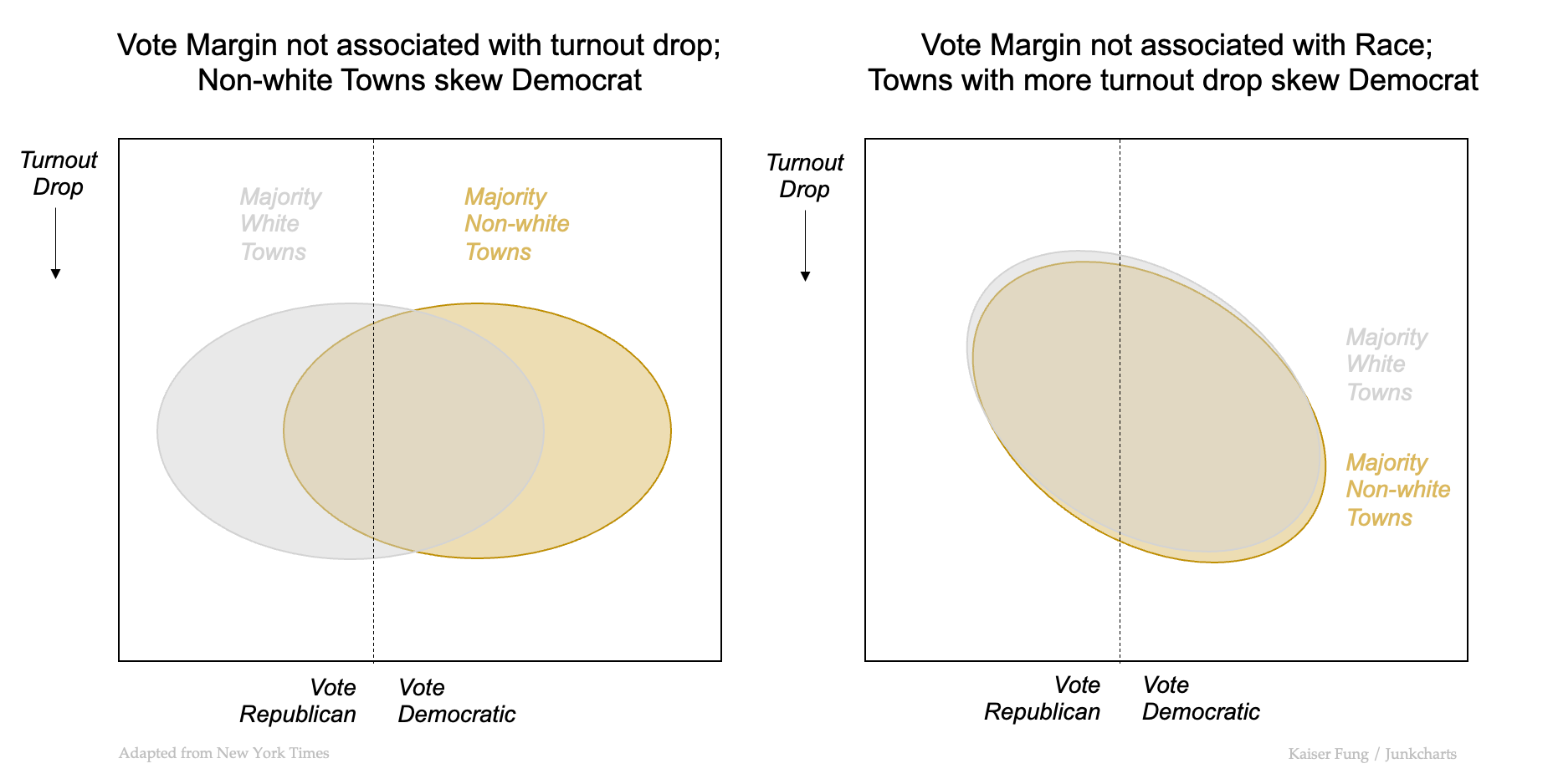
On the LHS chart, I assume that turnout is dropping everywhere about the same in 2021 so Effect 2 is absent. The relationship between Turnout Drop and vote margin is modeled as a flat line. Since Effect 1 is present, I expect the majority non-white towns to skew Democratic, and therefore the cluster of yellow dots is situated to the right of the cluster of gray dots.
On the RHS chart, I assume Effect 1 is absent, meaning that vote margin is not associated with race. (This is a thought experiment.) This assumption implies that the yellow and gray clusters must overlap, so that voting behavior does not depend on the majority race in these towns. If Effect 2 is present, e.g. if I assume that towns suffering higher drop in turnout skew Democratic, then the relationship between the two variables plotted is a negatively-sloped line.
The actual pattern is the combination of these two, which is what statisticians mean by an "interaction."
It's from the RHS chart that we can see why it's silly to impose "change one while keeping the other constant." To keep the other effect at bay, we have to assume that towns with majority non-white populations have similar voting margins as towns with majority white populations, a clear misrepresentation of reality. Said differently, many of the voters who are skipping the 2021 elections are the same voters who live in majority non-white towns, and we can't keep them in one column while deleting them from another column.