Unscientific poll?
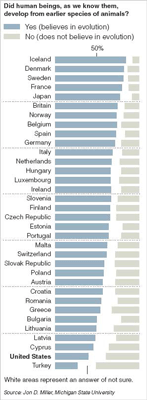

This decent chart adequately brought out a, to some, shocking point that the U.S. ranks next to dead last in our unscientific attitude towards evolution.
I have commented on 3-category bar charts before: putting the "not sure" category in the middle allows the reader to compare "Yes"/"No" responses easily. I prefer lightly-tinted boxes for "not sure" to help gauge its size.
It's a good idea to provide the 50% label at the top. It is mischievous to use a guiding line, akin to a tick mark, to indicate the "not sure" legend. This line segment, while entirely redundant, creates confusion as the reader, exhausted by the height of the chart, would be desperately seeking the 50% mark at the bottom. Without such, it is taxing to figure out what % of Americans actually answered "yes".
The biggest distortion in this chart is the absence of scale, in particular, population scale. Half of the U.S. population represent many times the number of people as half of Cyprus, for example. The choice of countries in the survey is also heavily biased toward small European countries. In fact, Japan appears to be the only non-European country depicted, aside from the U.S. while curiously, the "special" partner of the U.S. is missing.
Reference: NYT, approx. Aug 16, 2006.
Here's a previous post on Science, with a link to Darwin's classics.


