Updating the unemployment chart
How is the U.S. labor market doing in 2026?
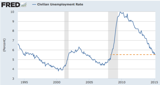
The official statistics continue to show that the U.S. job market is healthy (for example, here). The unemployment rate has been around 4% for a few months, which is the lowest it's been for several cycles.
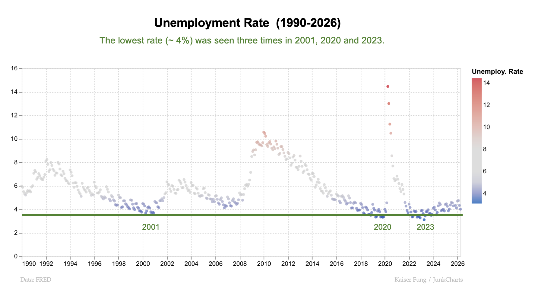
In this chart, I encoded the unemployment rate using a red-blue color scale. Red dots indicate months of high unemployment rate, which has spiked to 10 percent in 2010 and over 14% during the Covid-19 pandemic. Notice that in good times, the unemployment rate generally improves to about 4 percent. This level has been reached three times since 1990.
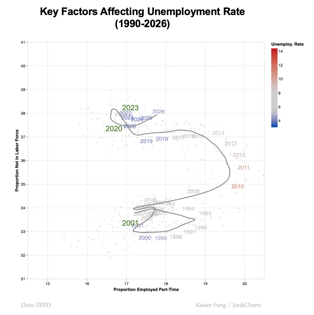
It turns out that there are many roads that lead to Rome. An unemployment rate of 4% in 2001 is materially different from an unemployment rate of 4% in 2020. The aggregate statistics hide what is happening underneath.
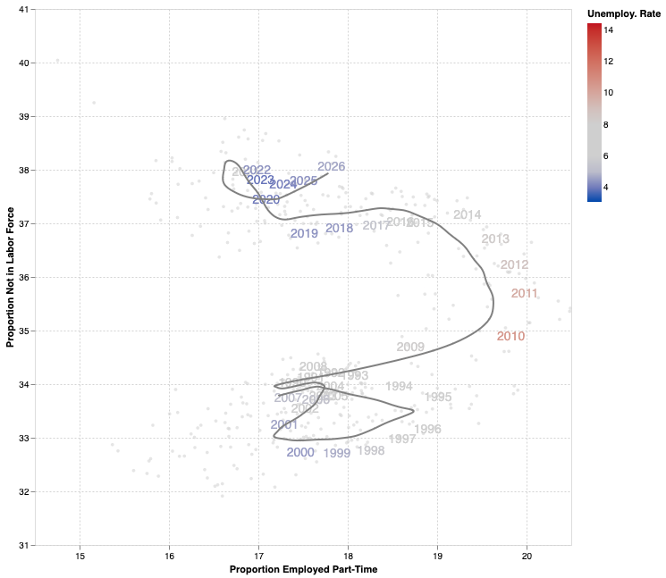
I previously designed the following chart depicting two important aspects that help us interpret the aggregate unemployment rate.
It's important to realize that the unemployment rate is not the number of unemployed divided by the population size. The denominator is the size of the "labor force," which may leave out a third or more of the population. The ones left out of the denominator are invisible to the Bureau of Labor Statistics; they are neither employed nor unemployed. The numerator counts the number of unemployed. If someone has worked at least one hour during a reference time period, they are considered employed. Therefore, some of those who are employed are actually employed part-time.
The scatter plot brings together two underlying drivers of the unemployment rate – the proportion of the population considered "not in labor force", i.e. the invisible; and the proportion of the employed who work part-time.
The path in the scatter plot shows the evolution of the relationship between 1990 and 2026. The year labels adopt the same color scheme as in the dot plot above. In other words, when the labels are red, the U.S. was facing high unemployment.
In 2001, the first time during this period the U.S. saw a low 4% unemployment rate, about a third of the population were excluded, and just over 17% of those employed were working part-time.
Then, in 2020, when the aggregate unemployment rate again showed 4%, the path in the scatter plot has moved to an entirely different location. An extra 4% of the population have exited the labor force, not to be counted. The amount of part-time workers has settled back to about 17% after jumping to almost 20% in the early 2010s.
The employment situation since 2020 has been stuck in this new location. Most recently, the line is moving northeast, which is the worst possible direction: more people are leaving the labor force, and more workers are working part-time.
As discussed in Chapter 6 of Numbersense (link), people not in labor force include not only those who are too young or old to work, or those who are incarcerated but also those who are deemed by the government to not want work.
The following small-multiples version of the scatter plot shows different periods of time in different panels.
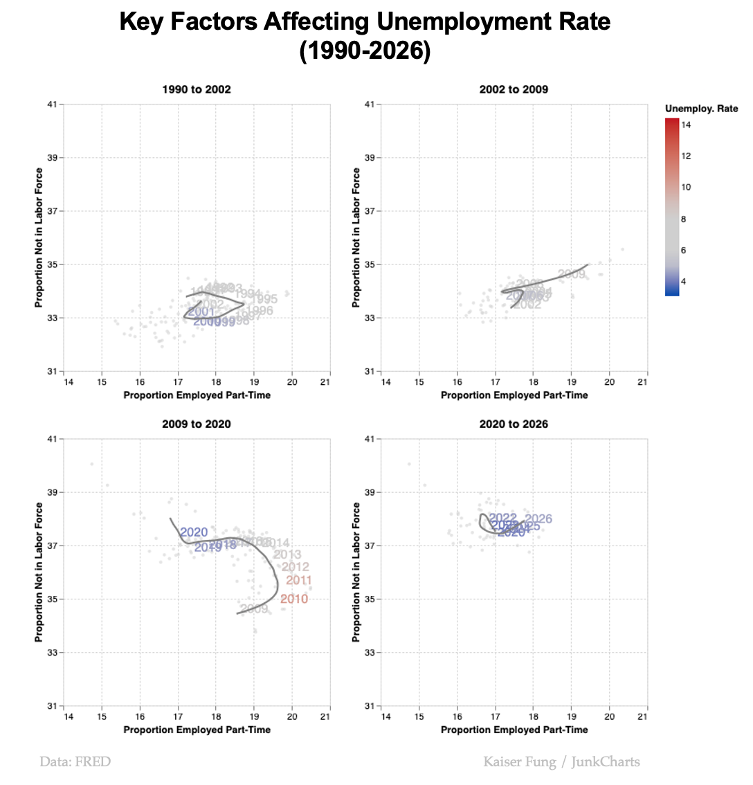
The bottom-left panel shows a transition period when the path shifted from the bottom of the chart to the top of the chart. Beyond 2020, the path has been hovering in that region with no indication that it would be re-directed downwards.
Relevant prior post: