Using data tables
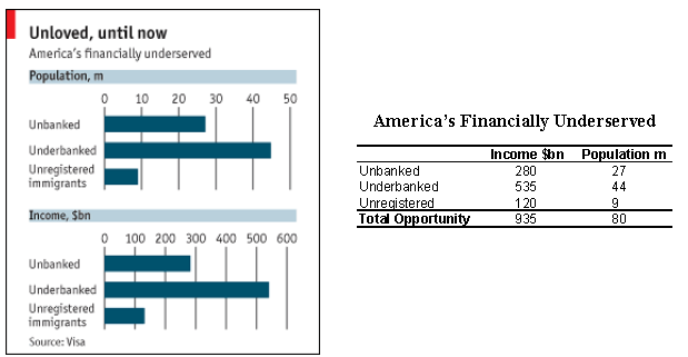
Charts are supposed to elucidate data. We love charts here but sometimes the love is misplaced. I noticed the following Economist chart by way of the Truck and Barter blog.

It's a very simple chart, with only 6 pieces of data. And yet, presenting the data in a table would have been clearer. One measure of the effectiveness of charts is the amount of time the reader uses to locate the data. On the table, everything the reader needs require two steps, looking up the right row and the right column. However, on the bar chart, the reader must first look up the right chart, then the right bar, and then estimate the length of the bar by referencing the axis; if the reader wants the totals, s/he must estimate three lengths and mentally add them up.
Reference: "Into the Fold", Economist, May 4 2006.


