Visualizing web statistics
Tim inquired about:
how to create an elegant graph for Web visitor traffic statistics that shows both how many views a page gets and then how many people click that page to go further ("conversion rate"). Part of the problem is that conversion rates vary from, say, .3% to 50% (a wide range).
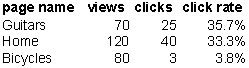
Lets work with this sample data set.

I ordered it from highest to lowest click rate, which is the primary metric of interest. The number of page views is of interest too as sometimes rarely-visited pages may have high click rates.
At this point, it's important to know the context. Specifically, who controls the allocation of pages? Did the data come from a randomized experiment? Or did they get a self-selected sample (e.g. web surfers deciding which section of the site to visit)?

The first construct I tried is the "lift curve" often used in marketing. It's the same thing as the Lorenz curve used by demographers but interpreted differently. Here, we see that Guitar pages accounted for 26% of the page views but 37% of the clicks; House pages accounted for an incremental 44% of the pages and 59% of the clicks; etc. The relative click rates are immediately clear from the steepness of the line segments. The lift curve is appropriate for the self-selected case, in which we can take the allocation of page views as fixed.

If the allocation of page views is a decision to be made, then it doesn't make much sense to accumulate page views. The second construct is the "scatter plot" of % clicks versus % page views. The steepness of the line through the origin helps us compare the click rates. Bicycles is clearly inferior in generating clicks.
Both these constructs are highly efficient; adding new data does not expand the chart at all.
Keen readers will observe that the slope of the line is not the click rate but rather a click rate index (relative to the overall click rate). This means that any data point above the diagonal has above-average click rate.


