Wading in waste

A poor graphic leaves readers wading in waste, in this case, the waste of time. (Thanks to a tip from Dr. Bruce W.)
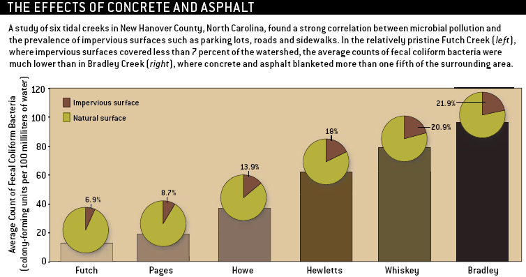
This very busy chart conveys a simple research finding, that the density of bacteria increases with the prevalence of impervious surfaces. As Bruce pointed out, underlying this chart is but six observations taken at selected tidal creeks, each observation being a (paired) measurement of bacteria count and prevalence of impervious surfaces.
A factory worth of graphical elements was employed, including columns, pies, colors, data labels, legends and so on. The result is utter confusion. How is it that the tip of each column does not coincide with the center of each pie? Do equal-sized pies imply equal surface areas? What is the bacteria count at each location?

A scatter plot brings out the key correlation with minimal fuss.
Reference: "Wading in Waste", Scientific American, June 2006


