Wannabell
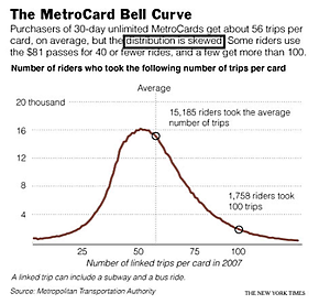

This graph, called the Bell Curve, is a wannabe.
The first hint is its asymmetry, the right tail being longer than the left tail.
Further, the helpful labelling of the "average" does not coincide with the peak of the curve.
The author of the annotation seemed to understand, calling the distribution "skewed". A Bell Curve is not skewed.
This is a pity because the designer might have selected a different chart type if she wasn't so enamored by the bell curve object.
The data tells us about users of 30-day unlimited passes in the New York City subway system: how many trips do they typically make? The card costs $81 while each trip costs $2 so anyone taking fewer than 40 trips in those 30 days would have been better off buying individual tickets. The "average" user took 56 trips. The range of trips taken was very wide, perhaps surprisingly so.
Several key pieces of information has been left off the chart. What is the total number of riders? Without this, there is no way for readers to understand 15,185. What is the smallest (and largest) number of trips taken by any rider? Visually, it appears that the horizontal axis does not start at zero.
It would have been better to show a cumulative distribution with percentages of riders on the vertical axis. On such a chart, we can read off the median and any percentiles. In other words, it would be much more informative.
As it stands, I like very much the annotation of the 56 trip and the 100 trip points: they are great aids to help decipher the chart. It would be great to indicate the 40 trip point too.
For those more technically inclined: the graph also begs the question of whether it is an actual or modelled curve. It looks too smooth to be actual data. If it is a model, then it is definitely not a normal distribution. What could it be? A spline?
Reference: "In Decade of Unlimited Rides, MetroCard Has Transformed How the City Travels", New York Times, July 16 2008.


