Whither complexity?
The ever interesting Gelman blog ("Too clever by half") ponders about this enterprising NYT chart. Whatever its merits, this is one that requires close study.

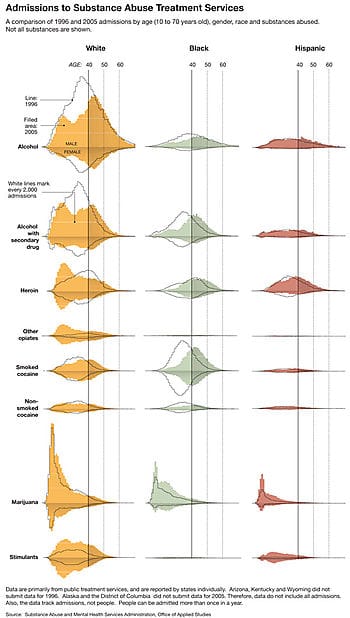
Reception is generally positive. Andrew himself learnt an important fact, that there are still more white people than other races in America! In statistics, we distinguish between two types of errors, the significant kind and the ignorable kind. From this perspective, using admissions count is a gigantic problem; it renders the rest of the chart useless. So I agree with Andrew. As ever, picking the right scale is the beginning of making a nice chart.
We can also use this example to discuss the concept of "interactions". When we go about presenting small multiples, i.e. comparisons of subgroups within a population, it's because we have observed differences between those subgroups; otherwise, it is both simpler and clearer to present the aggregate results. The present chart presents subgroups defined by race, gender, age and substance abused, that is quite a lot of subgroups.
Focusing on the first row (Alcohol), we note that the colored mass has shifted to the right, indicating more older people abused alcohol. This trend appeared for all races. Now scanning the other rows, we discover that only heroin abuse showed a distinctly different pattern, but only among whites. For every other row, it seemed that the change from 1996 to 2005 was similar across races.
By breaking out substance abused, the designer added 21 little charts (7 sets of 3). Only one set (heroin) added information to what was true in aggregate i.e. that substance abusers got older. The incremental gain in information does not justify the added complexity.
Nevertheless, the chart had many positive things such as judicious use of axis and gridlines and letting the graphical constructs speak for themselves (without accompanying data labels).
Reference: "Why is Mum in Rehab?", New York Times, Jun 14 2008.


