Working with lines
Here's how a great idea can be made better.

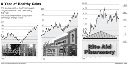
The unifying axis on the right hand side, described as "comparable percentage-change scales", is a great concept. The data being plotted are the cumulative percent return for each stock from the start of 2006 to the day of publication.

If the three lines are superimposed, we can see the relative performance throughout the year. Within these three stocks, Walgreens has clearly underperformed until recently. Also, plotting weekly rather than daily returns reduces clutter. The only grid-line of importance is the 0% line, which is what is left.
In addition, the three other axes, depicting actual prices, are redundant; removing them significantly enhances readability.
Some will insist that actual prices must be shown; the following includes key bits of data in a subtle way.

Reference: "Drugstores are Looking More Like a Growth Story", New York Times, Sept 10 2006.


