Worst statistical graphic nominated
Phil, over at the Gelman blog, nominates this jaw-dropping graphic as the worst of the year. I have to agree:

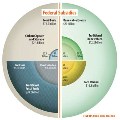
Should we complain about the "pie chart"/4 quadrants representation with no reference to the underlying data? Or the "pie within a pie within a pie" invention, again defiantly not to scale? Or the creative liense to exaggerate the smallest numbers in the chart ($2 billion, $0.3 billion) making it disproportionate with the other pieces? Or the complete usurping of proportions (e.g. the $0.2 billion green strip on the top right quadrant compared to the $0.3 billion tiny blue arc on the top left quadrant)?
Or the random sprinkling of labels and numbers around the circle even though if one takes the time, one notices that the entire chart contains only 8 numbers, as follows:

***
Instead, we can display the data with a small multiples layout showing readers how the data is structured along two dimensions.

Or a profile chart may also work:


