A cheesy graphic
Which nation makes the most cheese?
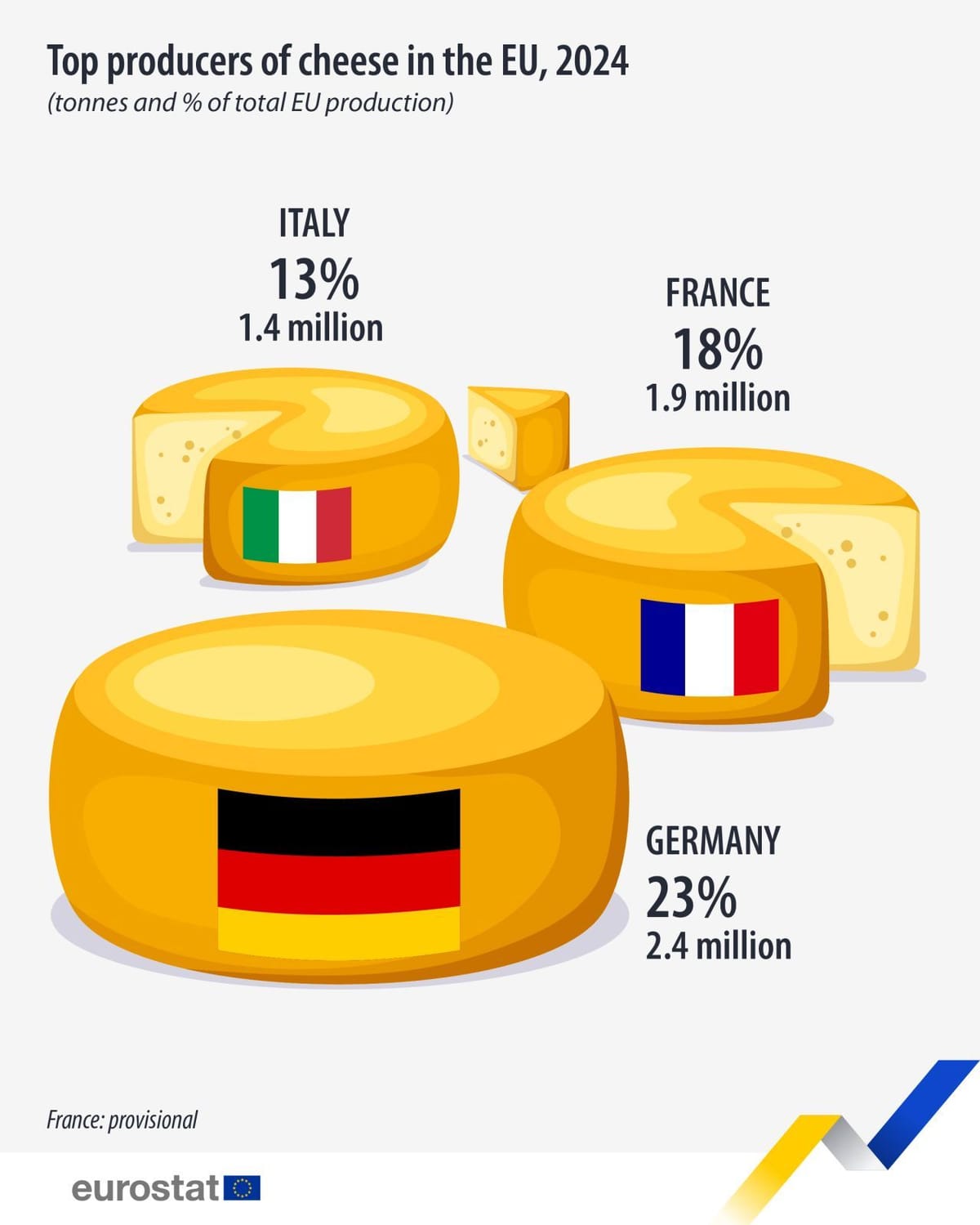
Jorge Camoes featured this cheesy graphic by Eurostat in a recent Linkedin post. It's a fun graphic that brings out the unexpected, at least amongst the uneducated. Who knew Germany makes more cheese than France or Italy?
What kind of chart is it?
It's side-by-side pie charts. The twist is that the chart does not encode the raw data, neither the tonnage, nor the proportion of tonnage. Instead, the chart plots index values, with Germany set to 100%. In that scale, France is 1.9/2.4 = 80% and Italy is 1.4/2.4 = 60%.
Therein lies the problem. The chunks of cheese bitten off France and Italy's rinds are roughly equal sized so I don't think they are scaled properly.
Possibly, the designer is simultaneously manipulating the size of the pies, and the bitten-off chunks?
I took my ruler out and it's neither here nor there.
The closest is if we take whole pies of all three countries. I estimated that the radius of France is about 75% that of Germany, Italy is 56% of Germany, so close enough to 80% and 60% respectively. But even this encoding is problematic because we should be encoding the data in the areas not the radii of the pies. (If we take whole pies, we have moved from pie charts to bubble charts.)
The ratio of areas is 66% and 32% respectively, which takes us further from the data.
If we now bite a chunk out of France and Italy but not Germany, as per the graphic, then the ratio further slides away to 44% for France, and 25% for Italy.