A matter of timing
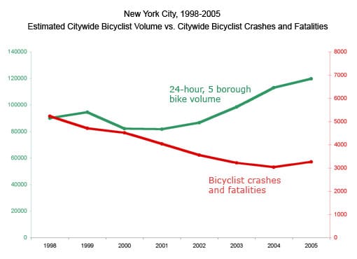
A reader Carly C. from Streetsblog created the following chart and wanted to know if there are better ways to present the data. She already disliked the double axes and thought of various options including using relative scale.

Generally speaking, dual axes in which each axis takes its own scale is like a football team with two "good" quarterbacks rotating under center, or two "great" CEOs sharing power. We have never seen those situations work out.
When we have two quantities under comparison, we like to put them on the same scale. In this case, converting the scale from absolute numbers to relative would do the trick.
The data paint a powerful story: as bike volume increased over time, bike accidents decreased. The stitching together of two lines at year 1999 was an artifact of manipulating the scales. What Carly had in mind can be accomplished using an index set at 100 in 1999.

This would lead to the chart shown left. The substance of this chart and Carly's original is the same but the revised one has a single axis.
Indexing time series data is a widely used technique. Each issue of the Economist, for example, contains many such charts. This type of chart, however, suffers from a critical and under-appreciated problem: the visible pattern frequently and critically depends on timing. Specifically, it makes a huge difference which year is selected as the baseline (index=100).
A lot of mischief is possible by picking a special baseline. Take for example, I created the same chart three times, using 1998, 1999 and 2000 respectively as baselines. When 1999 w

as 100 (middle chart), a criss-cross pattern showed up between 2001 and 2002, leading readers to conclude that the gap between growth in volume and growth in accidents developed during 2001. In the other two charts, the gap appeared around 2000. Also, the bottom chart exhibited a clear growing gap (after dumping the disagreeable data before 2000).
Unfortunately, this is a feature of such charts; whether or not timing distorts the information presented depends on how rugged the underlying data is. Put another way, these charts can be affected by outliers. (In this example, there were sharp changes in bike volumes in 1998-2000.)
Reference: Streets Blog
PS. [5/12/2008] How opportune was Andrew's post on R graphics default headaches. I was too lazy to figure out the defaults and let R figure out the dimensions (poorly); with Jake's suggestions, the new set of charts looked much better.


