A promising infographic about motorcycle helmets
The New York Times graphics team shows us how to do infographics poster the right way. They recently put up a feature showing how the repeal of helmet laws is linked to increasing vehicle fatalities. The graphic is here.
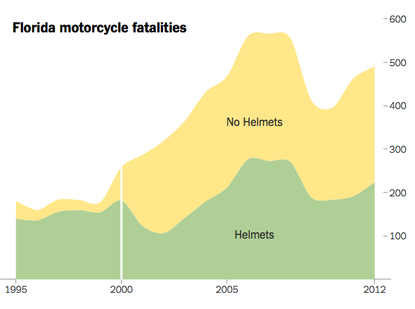
One of the key charts is this one (second to last screen):

The graphic tells the story, no additional words are needed. (Actually, you'd have to come from the prior page to know that the white vertical line represented the year in which Florida repealed its helmet law.)
Of course, one state does not prove a trend. It appears that other states face the same situation. It would be nicer if they could start this next chart at an earlier time.

I'm surprised by how much these lines fluctuate given that the raw counts are in the hundreds.
I wonder if there is any active debate in Florida or elsewhere as it would appear that the helmet law repeal may have caused hundreds of unnecessary deaths. Have people been coming up with other explanations for the sharp rise in motorcycle fatalities involving those not wearing helmets?


