Another test of self-sufficiency
Reading an infographic of Swiss elections

I came across this infographic by the Swiss paper, Neuen Zürcher Zeitung, on my Linkedin feed (thanks, Markus Ikehata).
The piece is done in German, a language I don't speak. So reading this data visualization is like applying a "self-sufficiency test". That's the test I use to determine how much work the visual elements of a chart are doing to convey insights (as opposed to text and numbers).
I'll now document what I've learned from reading the just the visual elements of the infographic. Feel free to correct any errors in the comments below.
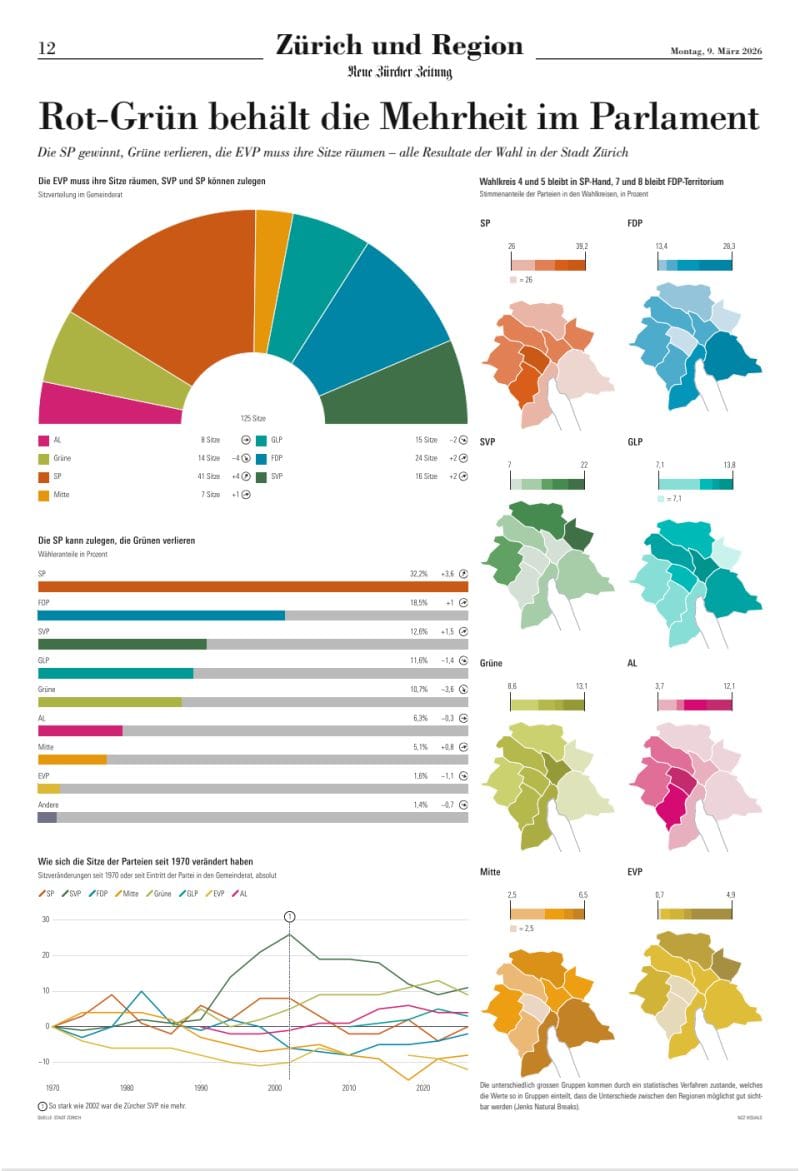
The first component is a semi-circle chart, that is quite canonical when it comes to representing parliaments.
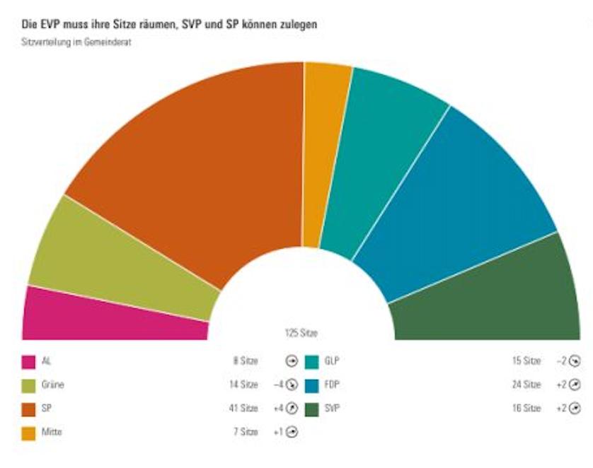
I can count seven major parties represented by what I'd presume their typical party colors. The deep orange party (SP) has the plurality although a coalition of possibly three parties are needed to claim a majority.
The second chart is a side-by-side bar chart.
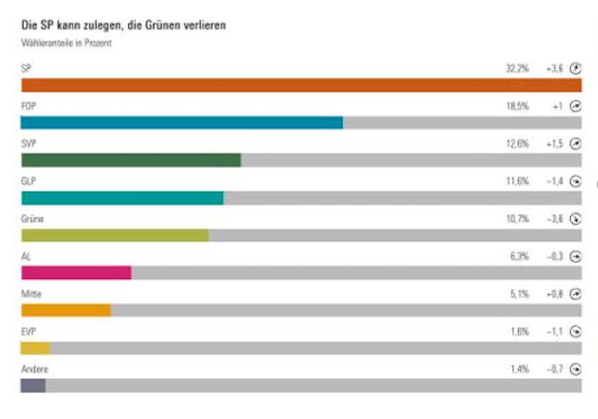
This chart uses the plurality party (deep orange) as the anchor, and is designed to display the importance of the other parties relative to it. The second largest party has a bit more than half the number of seats as the first party.
Curiously, this chart uses nine colors while the semi-circle chart has seven. On further inspection, the first seven bars correspond directly to the seven parties shown in the semi-circle. EVP (yellow) is omitted from the first chart: a mystery. The gray bar shows "others," as I came to realize below. (I also confirmed that "andere" is German for "others".)
Now, the third chart is a line chart.
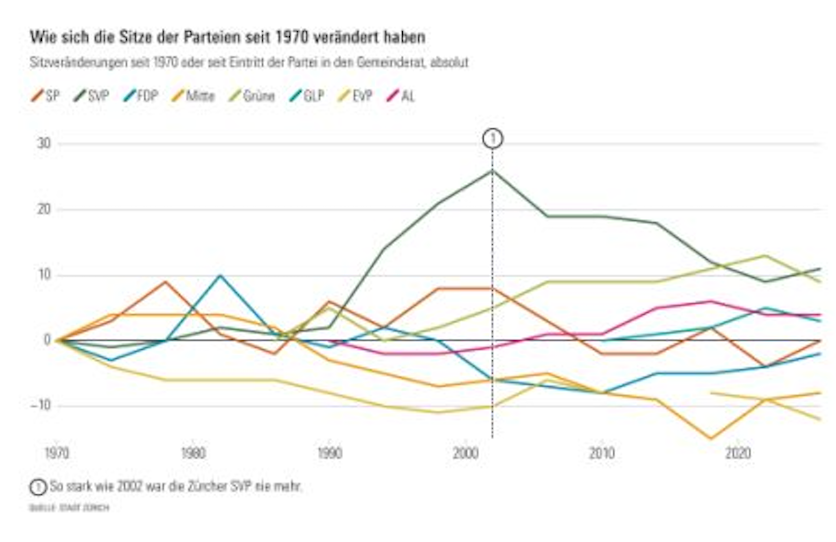
This chart shows a trend from 1970 to today. It has eight colors. This is how I figured out that the omission of the gray bar is different from that of the yellow bar.
I'm scratching my head, trying to reconcile the line chart with the semi-circle. This chart shows the plurality party (orange) as mostly hovering near the zero level, with the two green lines clearly above it. I can see that all lines start at zero in 1970, thus, it displays an index relative to that year. I gather that the deep orange party (SP) has always been strong, and has maintained its number of seats throughout the decades. Meanwhile, the parties represented by the green lines (SVP, Grüne) have been gaining seats in the recent past.
Something happened in 2002 that merited a footnote.
Finally, on the right side, we have two columns of maps. (I have altered the shape of the grid below to save space.)
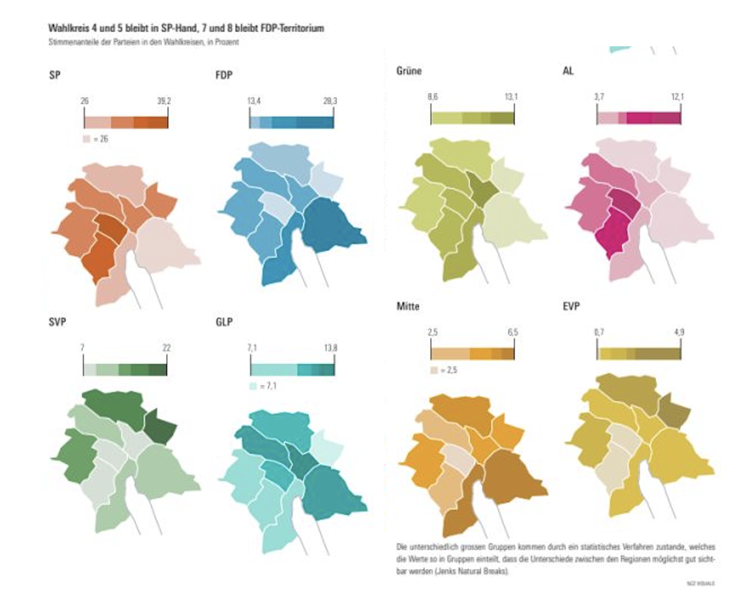
This is a small-multiples presentation of the the same eight parties, without the gray ("others") category.
They show the relative strength of each party across nine regions of Switzerland. Be attentive to the scales. What's the question answered by this chart? It's the geographical distribution of the strength of each party. It's best to interpret each map as a separate entity.
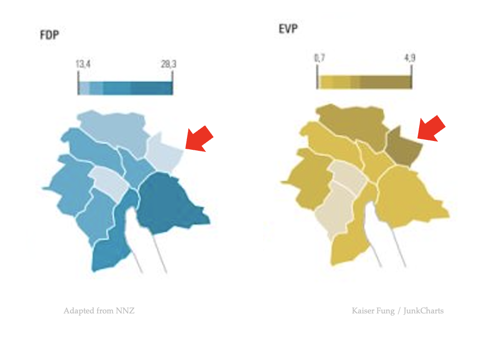
We shouldn't fixate on one region, and compare the shades of color, to understand the relative strengths of each party in a given region. That's because every map has its own color scale, adapted to the range of data in each map. For example, in the region indicated by the red arrow below, EVP has maximum strength (value of 4.9 according to the legend) while FDP is weak. Nevertheless, "weak" by FDP standard is still significantly more than 4.9.
In conclusion, this NNZ effort passes the self-sufficiency test comfortably. Even though I haven't read any of the text, I'm still able to learn a lot about the Swiss elections. The text assists the reader but the visual elements are self-sufficient.
(If you see any misinterpretation, please make a comment below. I hope I don't have to overturn my own conclusion 😃 )