Avinash's scoring rubric for data visualization
Eight ingredients of great graphics
Here's the always-entertaining Avinash on data visualizations (link).
tldr; He presents a (pseudo-)"algorithm" for great data visualizations. His scoring rubric consists of eight items: time to insight, effort to comprehend, trust, hierarchy, logic, nuance, no gimmicks, and influence.
All of these should be familiar to Junk Charts readers. I like to express the first two in terms of a "return on effort" metric. See this post. It's not that every graphic that requires a long time to process is bad; the issue is when we expend the effort but don't receive the reward.
The last metric ("influence") is a very high bar. It's something we dream of, but rarely achieve. Worse, it may be easier to attain influence by deception using flawed graphics.
Avinash then analyzes four infographics that each explain Covid risks to illustrate his scoring mechanism. (The post was originally published during the Covid era.)
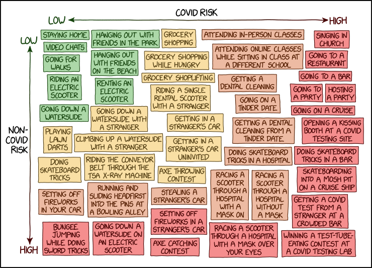
Since I included xkcd's cartoon up top, let's take a closer look. Like Avinash, I'm treating it as a data visualization, which was not the intention – so be warned.
We are looking at a grid. Based on the color scheme, it's a 4x4 grid. There's something of a scatter plot living on this grid. Think of each "dot" in the scatter plot as a text box. Each text box contains an activity. Each activity is rated on two dimensions: Covid risk, and non-Covid risk.
These axis labels are concise but imprecise. "Covid risk" really means the risk of catching Covid while doing said activity while "non Covid risk" signifies the general risk(s) of said activity other than catching Covid. For example, "staying home" has negligible risk of catching Covid (assuming there isn't an infected family member), and "staying home" presents low risks in general to someone, even if we ignore Covid risk (top left corner). By contrast, "singing in the church" is not typically regarded as a risky activity, but during Covid, it was a super-spreader event (top right corner).
This leads us to one avenue to consume this infographic. The diagonal going from top left to bottom right represents status quo: activities that didn't change in risk profile due to Covid. Our attention should be drawn to the top right corner, where those activities have elevated risks of catching Covid, relative to doing them prior to the pandemic. As a matter of curiosity, the activities shown in the bottom left corner are ironically less risky during Covid than prior.
Top right corner: singing in church, going to a restaurant, going to a bar, going to a party, attending in-person classes, etc. are usually considered dangerous but during Covid, that was how people got infected.
Bottom left corner: bungee jumping while doing sword tricks, going down a waterslide on an electric scooter, running and sliding headfirst into the pins at a bowling alley, etc. For these activities, the risk during Covid was rated lower than prior, probably because many of these recreational centers were closed, and they don't involve crowds of people.
xkcd actually makes a subtle point that isn't conveyed in the other infographics: that the risk profiles of some activities changed dramatically during a pandemic.
I can't figure out the color scheme of the graphic. The green, yellow, orange, and red colors correspond to the distance from the top left corner ("origin"), which represents low Covid risk and low non-Covid risk.
Take the red boxes. They show activities that have either high risk of catching Covid or high non-Covid risk (or both). The latter segment includes some activities with low Covid risk. It's confusing.
Though I said above the form of the plot is that of a scatter plot, I really should make a clarification.
For the notion of a "scatter" or "cluster" does not exist. What xkcd did is to fill the entire grid with evenly spaced data. The data are made up to represent all points in the grid; the density of the data does not vary, and as such, they do not contain any statistical meaning, unlike the usual scatter plots.


