Junk Charts
About
RSS
Posts by Year
Posts by Keywords
Sign in
Subscribe
data visualization
data visualization
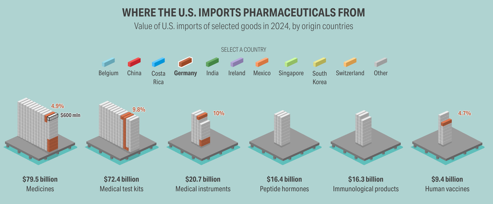
Notes on Webby nominees
Which data visualization project is best of the year?
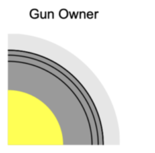
distortion
The paradox of circles
You can't have it both ways, no you can't
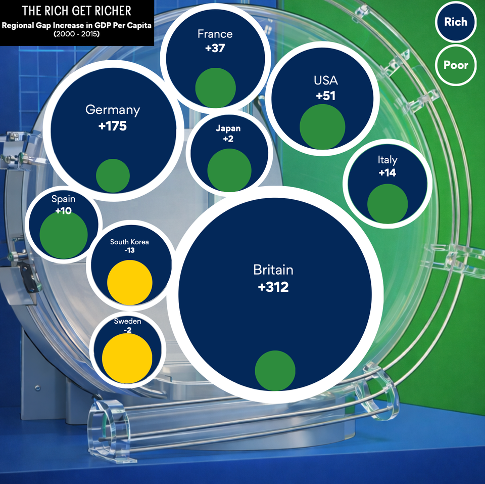
measurement
Getting metrics right is half the battle
Learning from some student projects
data visualization
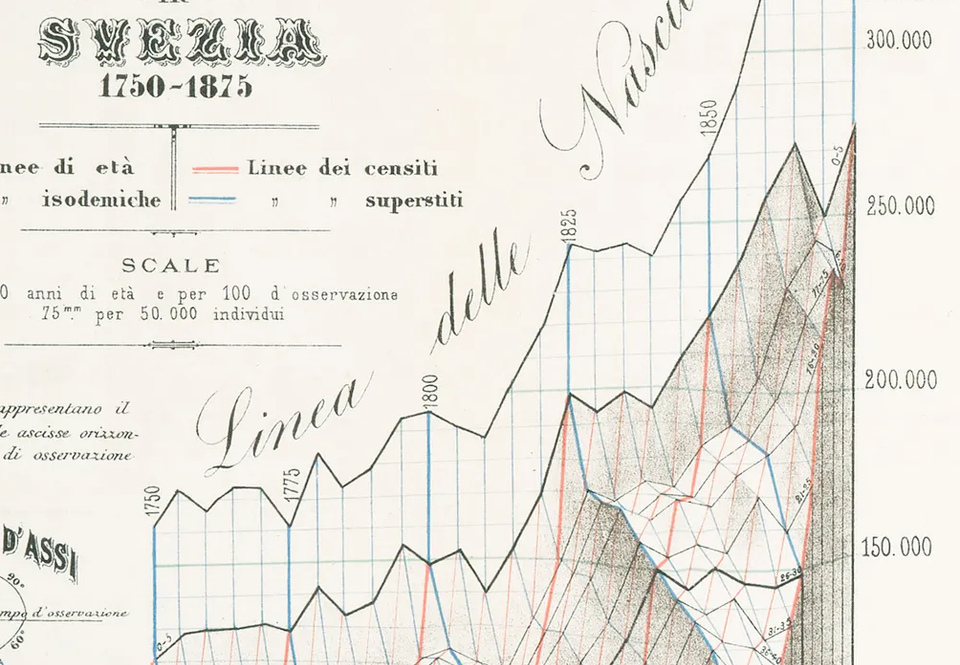
Beautiful chart to behold
Data visualization circa 1880 from Italy
radar chart
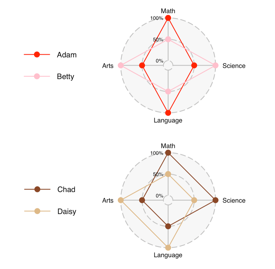
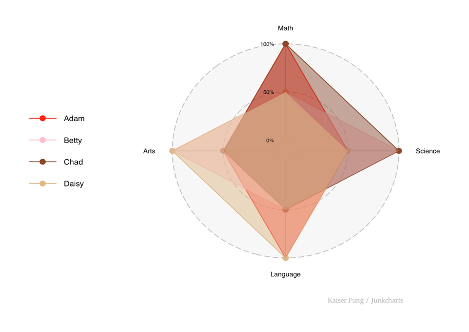
Data hunting on the radar (chart)
The data are not where you think they are
Table
Alternatives to radar chart 1
Sometimes, a table is all you need
Page 1 of 9
Older Posts
→