Beautiful chart to behold
Data visualization circa 1880 from Italy
As RJ puts it, "Bellissimo"!
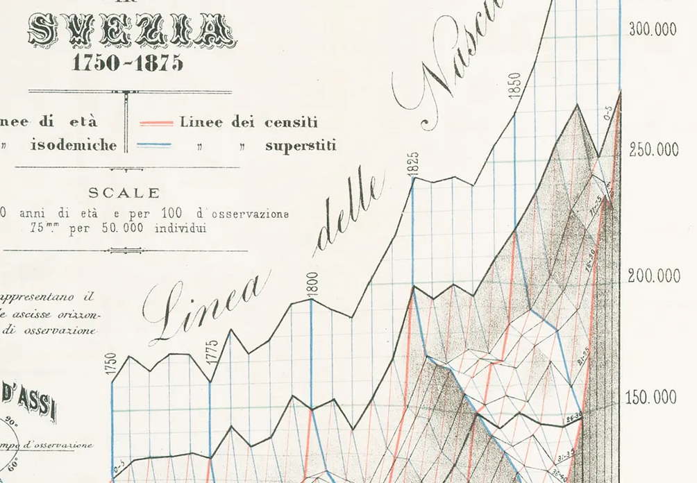
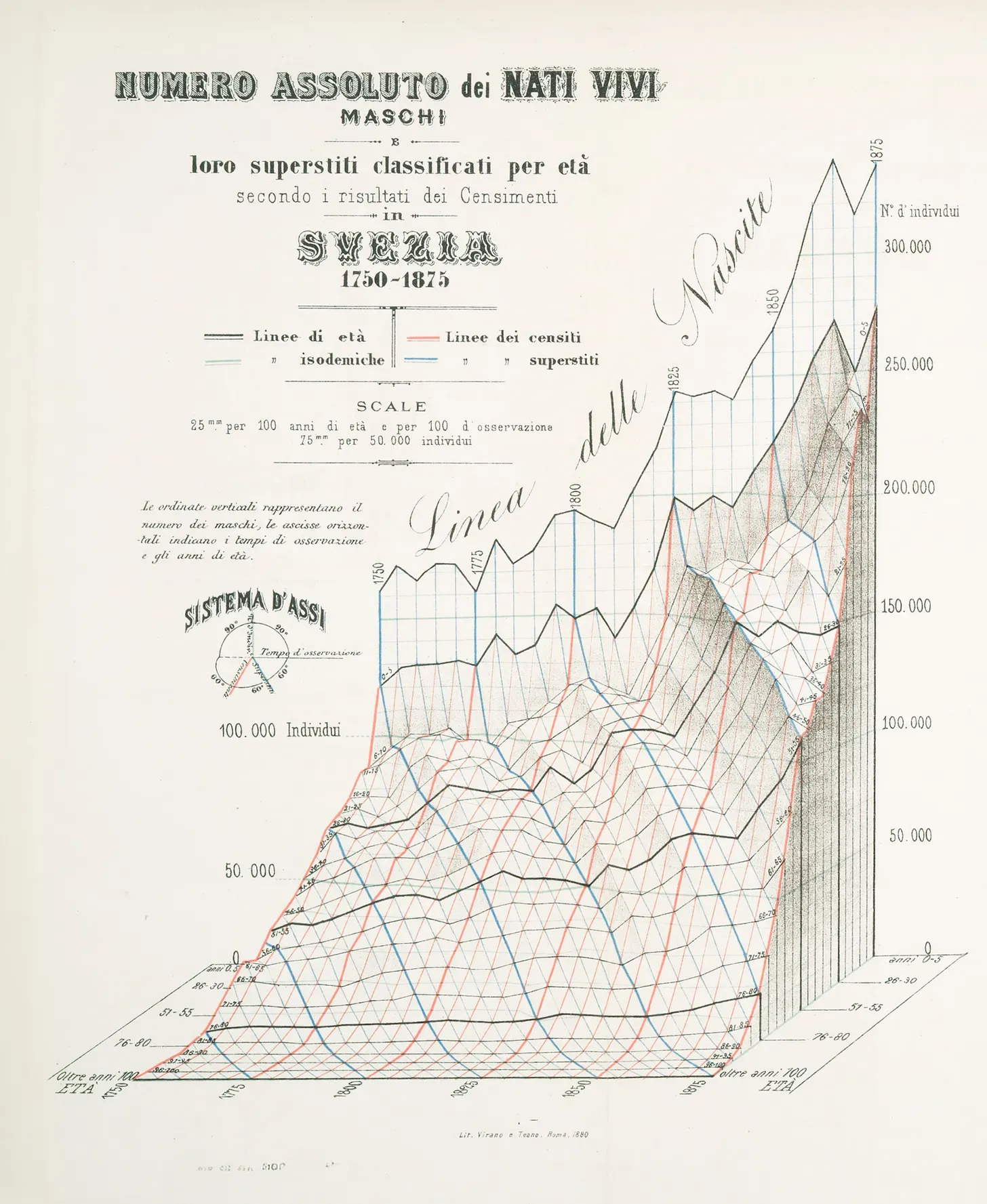
This 3-D graphic of population data - called a "stereogram" – by an Italian statistician from 1880 is striking in appearance. It's also a chart that requires – no, demands – one's time to dissect and devour.
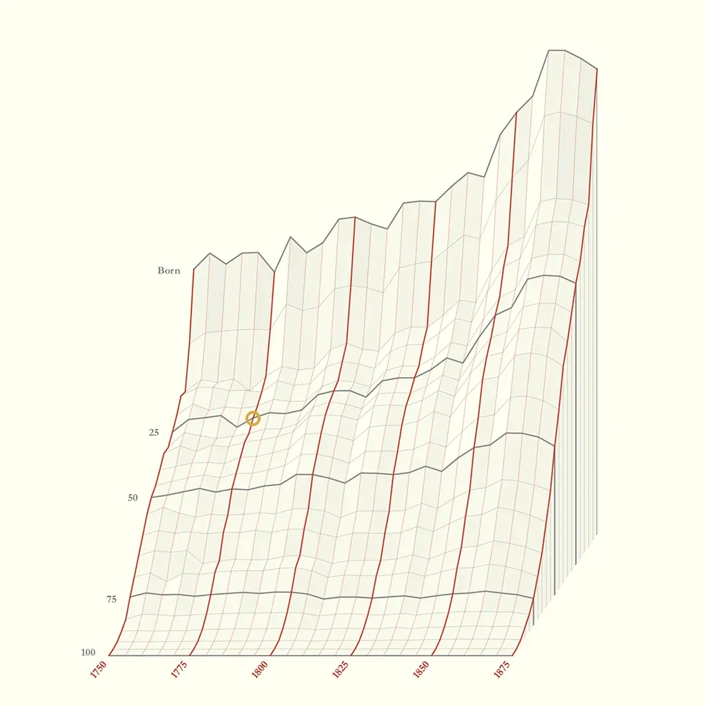
RJ adds to it by turning it into a modern interactive chart, with tooltips that help clarify the multiple threads of information.
The underlying dataset is any population growth data. Here is something similar from the U.S. Census Bureau (the 1880 graphic used old Swedish data when Sweden had high birth rates and high infant mortality).
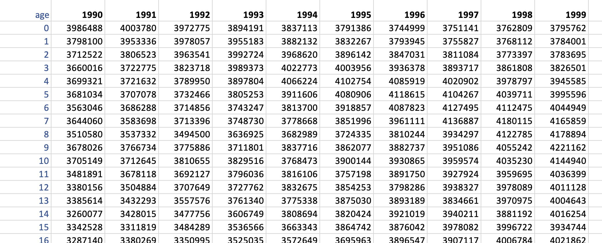
Each number in this table is a count of people of a given age in a given year. Summing down a column is adding up people of all ages in a given year, thus yielding the total population in that year. Scanning across a row shows the trend in the size of a given age cohort (adding across a row is not meaningful). In the first row of this table, we see that the number of births is declining during the 1990s.
I asked for calendar years 1990-1999, thus there are 10 columns, one for each year. There is one row per age from 0 to 100, followed by a catch-all row for anyone 101 and older, thus there are 102 rows of data.
If you think of any individual, this person does not ever stay in a cell. Each person moves diagonally down toward the right, one step at a time, as years pass – until the year of death, at which point that individual's line ends, contributing to a drop in the count at the next step. Every person must start on the first row.
For most people shown above, we only see part of their life line. It's truncated on the left (because they were born before 1990), and it's truncated on the right (if they died after 1999). In statistics, we call this left- and right-censoring.
This is a case in which the graphic is quite a bit more involved than the original data – the dataset is deceptively simple. RJ also cites a contemporary critic who properly pointed out that the Italian has turned a 2-D dataset into a 3-D object.
In unpacking the 3-D graphic, RJ offered this helpful view:
Like the table above, the years are laid out horizontally while the age groups (in groups of five years) are shown "vertically" (i.e., into the screen). The counts are the added third dimension, which represents the lift "up" from the base.
The red lines trace the counts by age in a given year. At the top, we have the total number of newborns, then the counts cascade down the cliff, eventually flattening out somewhat. This snapshot view is more familiarly presented in a population pyramid:
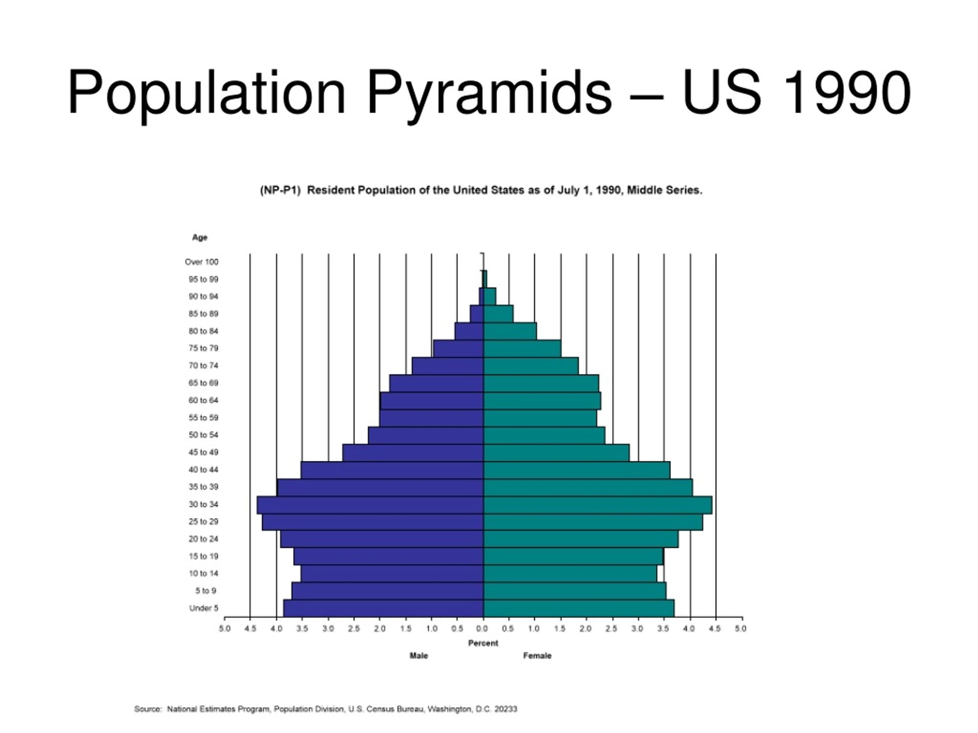
If we ignore the gender split in the pyramid, and look at the total bar lengths, then these bar lengths map to the heights of a single red line in the stereogram. (Percent vs. count doesn't matter here since we fix the year.)
Back on the stereogram, the dark gray lines that run horizontally trace the change in the size of an age group over time. It's a cross-sectional, longitudinal view. Births were scaling rapidly during that period in Sweden but the number who lived past 55 years had not grown much.
Such trends are typically shown on line charts. Imagine collapsing the age-group axis, plotting the count against year, and one line per age group.
The light gray lines on the stereogram are effectively gridlines.
Perozzo, the Italian scientist who made this stereogram, was even more ambitious. He also put in blue lines to trace individuals as they age over time.
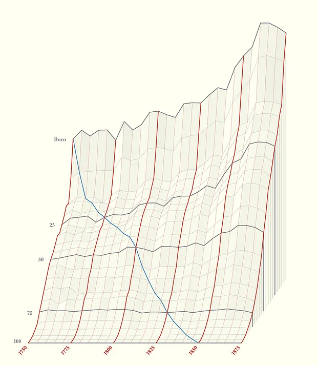
If an individual lived to 100 years old, then that person born in 1750 would follow the blue line down the hill as years passed all the way. The "drop" in height from one point to the next point represented those who left the cohort. In the 1700s, many Swedish kids didn't live to age 10, and then after age 45, the blue line plunged again.
The reader has to develop a feel for the rise and fall of the rolling terrain. Perozzo recognized this, and he applied shading to help out. I'm quite impressed by this little feature:

RJ mimicked this effect using a formula-driven approach.
It's worthwhile to read his entire post as he gets into even more details.
It appears that many readers find the stereogram too much of a good thing. It's a grand feast serving food coma.
I think it does have its place but it shouldn't stand alone. The 3-D graphic makes it clear that there are three ways of slicing the hill. Each slice can be represented as line charts in 2-D but we need the 3-D chart as a kind of legend to show where the slices are coming from.
What do you think? Let me know below.


