Bubbles of the same size

Frederic M. sent in this chart, together with his commentary.
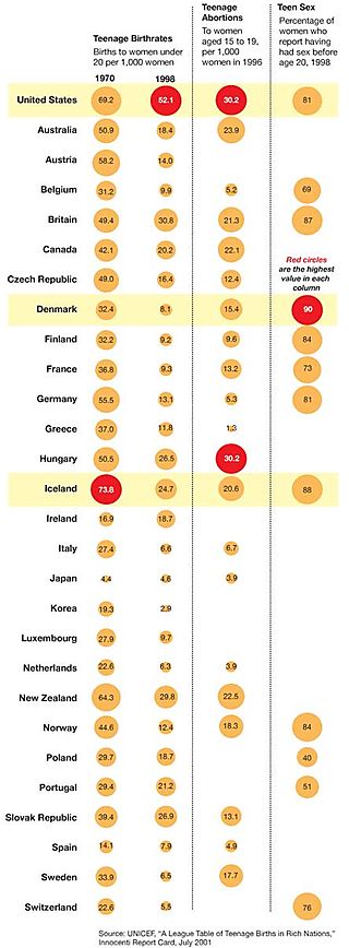
He wrote:
Bubbles across rows have vastly different numbers but their circles are of identical size (or vice versa). It borders on the ridiculous that all bubbles of the US row have the same size... The question if teenage birth rates and teen sex are correlated cannot be eye-balled with this kind of display. The fact that you cannot compare across rows make this an instance of “chart junk”.
I add:
White spaces -- always dangerous. Does lack of bubble imply no data or no abortions/sex?
Sorting -- this is what Howard Wainer called "Arizona first" with a twist (United States)
Loss aversion -- would U.S. readers be resentful if countries like Iceland are excluded? A much reduced version comparing U.S. to say Canada, U.K, Japan and Germany may yield more information for the reader.
Sufficiency -- if all the data are printed as in a table, why do we need the bubbles?
Reference: "Let's Talk About Sex ", New York Times, Sep 6 2008.


