Junk Charts
  • About
  • RSS
  • Posts by Year
  • Posts by Keywords
Sign in Subscribe

Simplicity

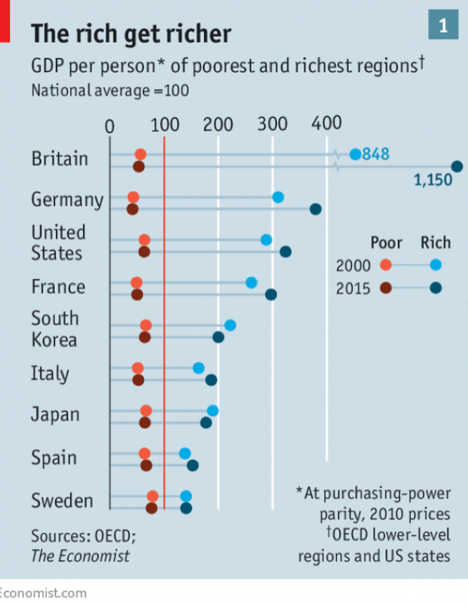
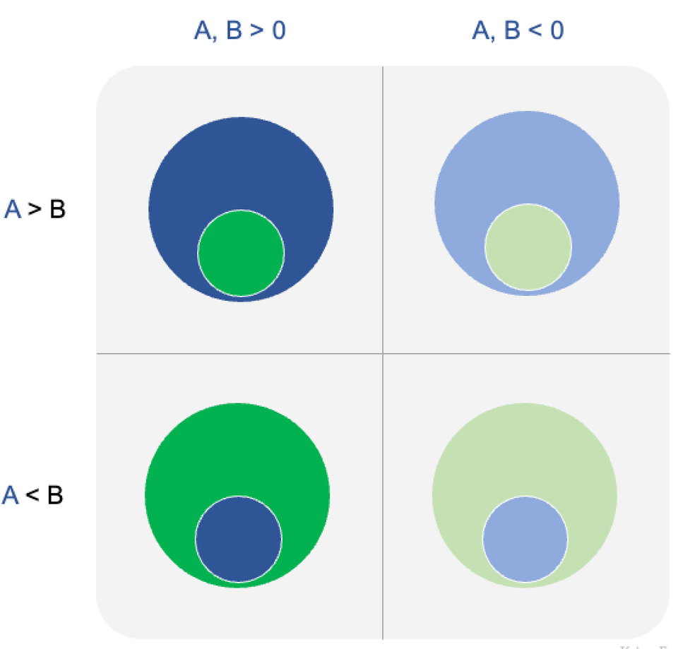
Guide to using pairs of circles
Bubble chart

Guide to using pairs of circles

A discussion of some design decisions
Read More
Facetune your charts
visual storytelling

Facetune your charts

The art of sacrificing precision
Read More
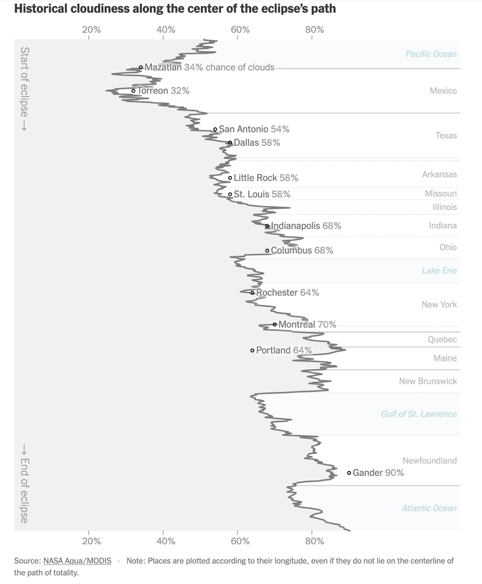
An abstract chart only statisticians love
line chart

An abstract chart only statisticians love

The NYT made this abstract chart about clouds on full eclipse day
Read More
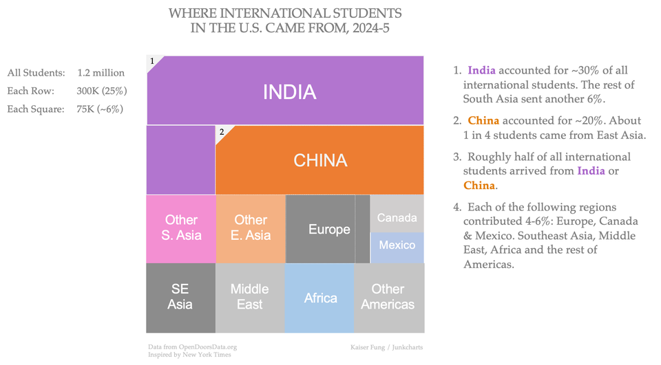
Students demonstrate how analytics underlie strong dataviz
ray vella

Students demonstrate how analytics underlie strong dataviz

Students demonstrate the value of analytics to data visualization
Read More
Simple presentations
Axis

Simple presentations

In the previous post, I looked at this chart that shows the
Read More
Prime visual story-telling
Clustering

Prime visual story-telling

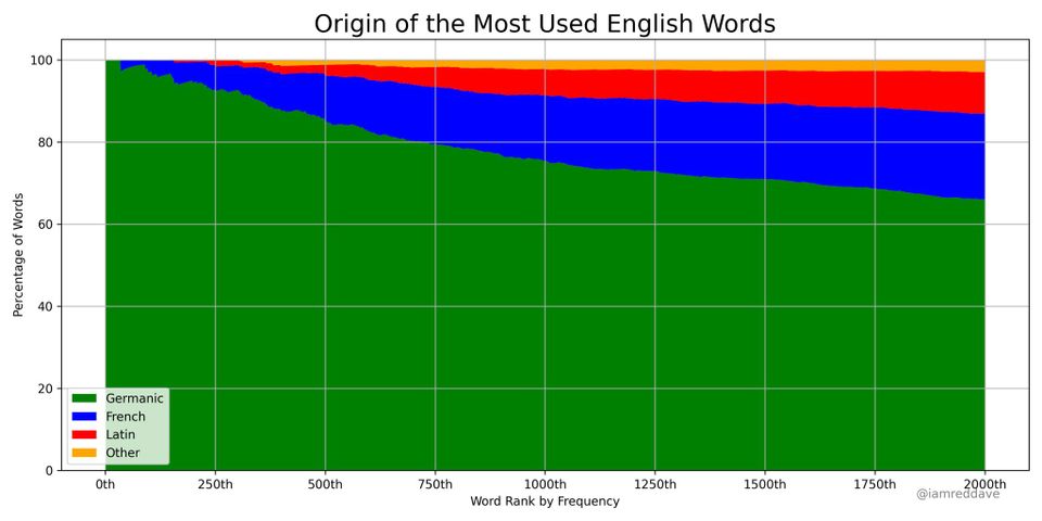
Kaiser appreciates this wonderful example of visual storytelling.
Read More
Page 1 of 7 Older Posts →
Junk Charts © 2026
  • BOOKS
  • COURSES
  • PRESS
  • CONSULTING
  • COACHING
  • CONTACT
Powered by Ghost