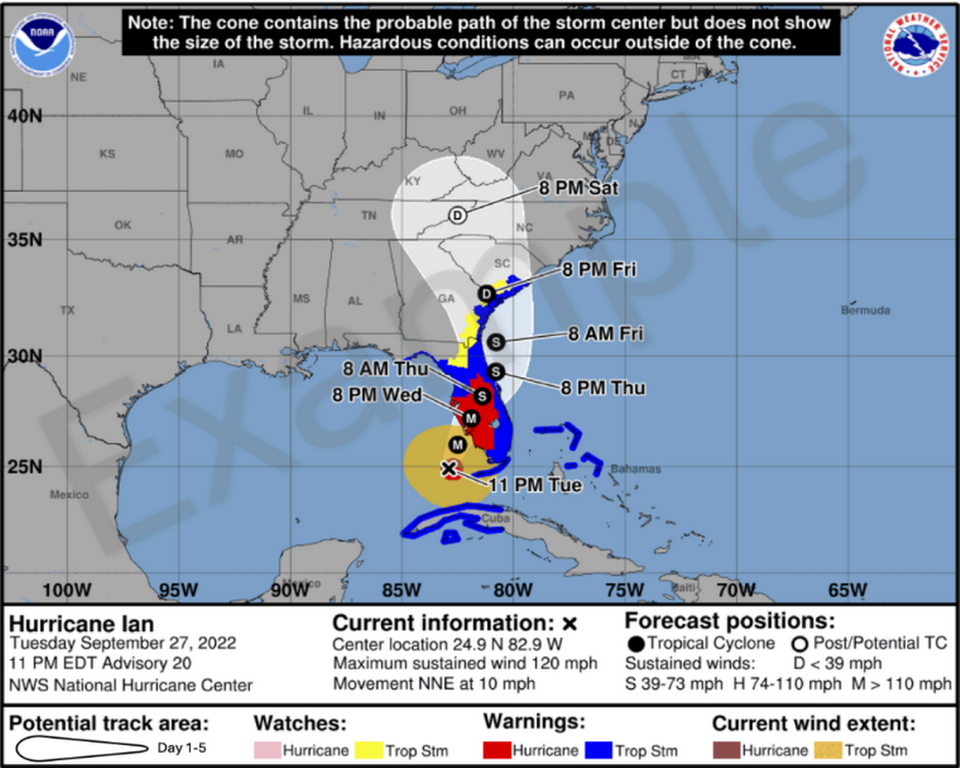
Aggregation Do you want a taste of the new hurricane cone? The National Hurricane Center (NHC) put out a press release (link to
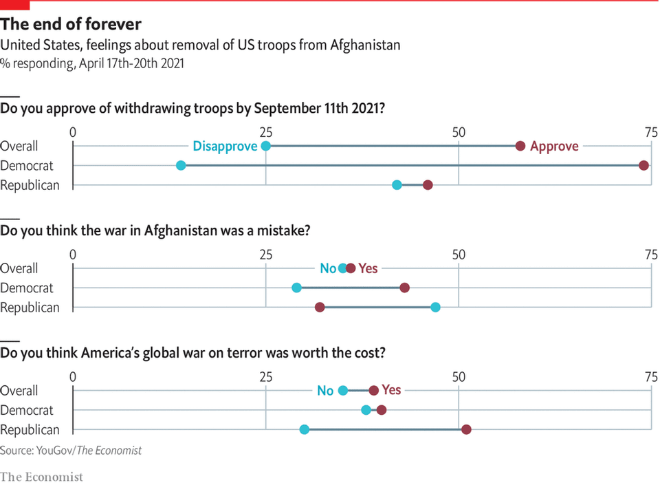
return on effort Reading this chart won't take as long as withdrawing troops from Afghanistan Kaiser deciphers a chart showing Americans' response to Biden's decision to withdraw troops from Afghanistan.
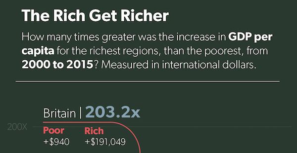
return on effort Bloomberg made me digest these graphics slowly Kaiser enjoys reading the graphics in the Businessweek issue on elections.
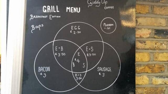
Food Foodies say, add dataviz spice please Kaiser Fung, founder of Junk Charts and Principal Analytics Prep, explains why the Venn diagram is not easy to read, and discusses some nice interesting food and beverage menus.
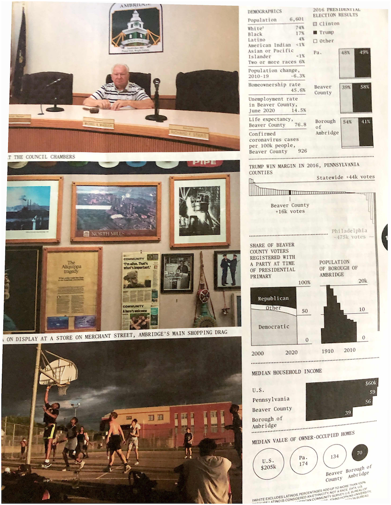
Bar chart Dot plots are under-valued, that's all Bar charts are over-used and over-rated. Just casually, I found this example